Data Reports:
My first Project with CENTRO was to design the Data report. While there were past reports to base this off of, The Art's & Culture Director stressed the importance of making the information digestible/easy to look at since many reports end up being walls of text, and we want this information to be accessible to all people, not just scholars. Here are some tweaks that gave this report a more humanizing feel to it:
1. I made these patterned page to fill space in the beginning and end of the book. Personally it adds a small human touch, as you aren't just thrown right into the report.
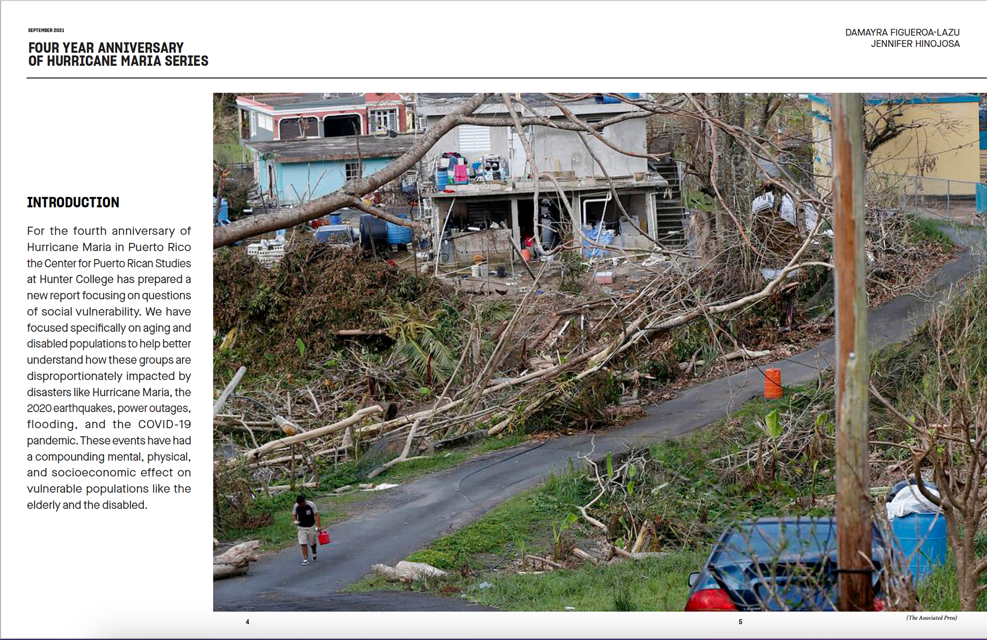
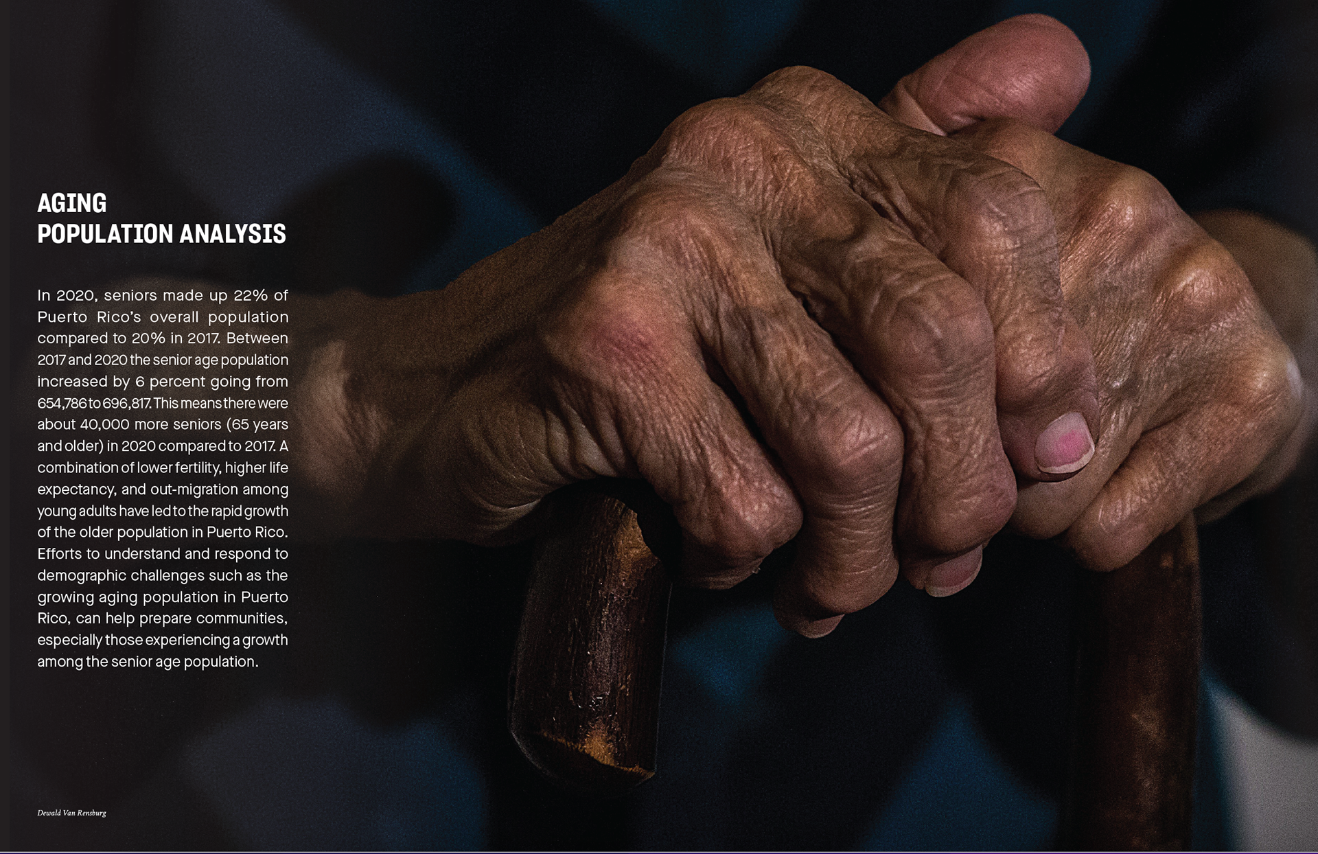
2. I added images to the report as well. I placed these image at the start of sections, the first spread being the start of the entire report, the next 2 being the start of sections that the report is covering.
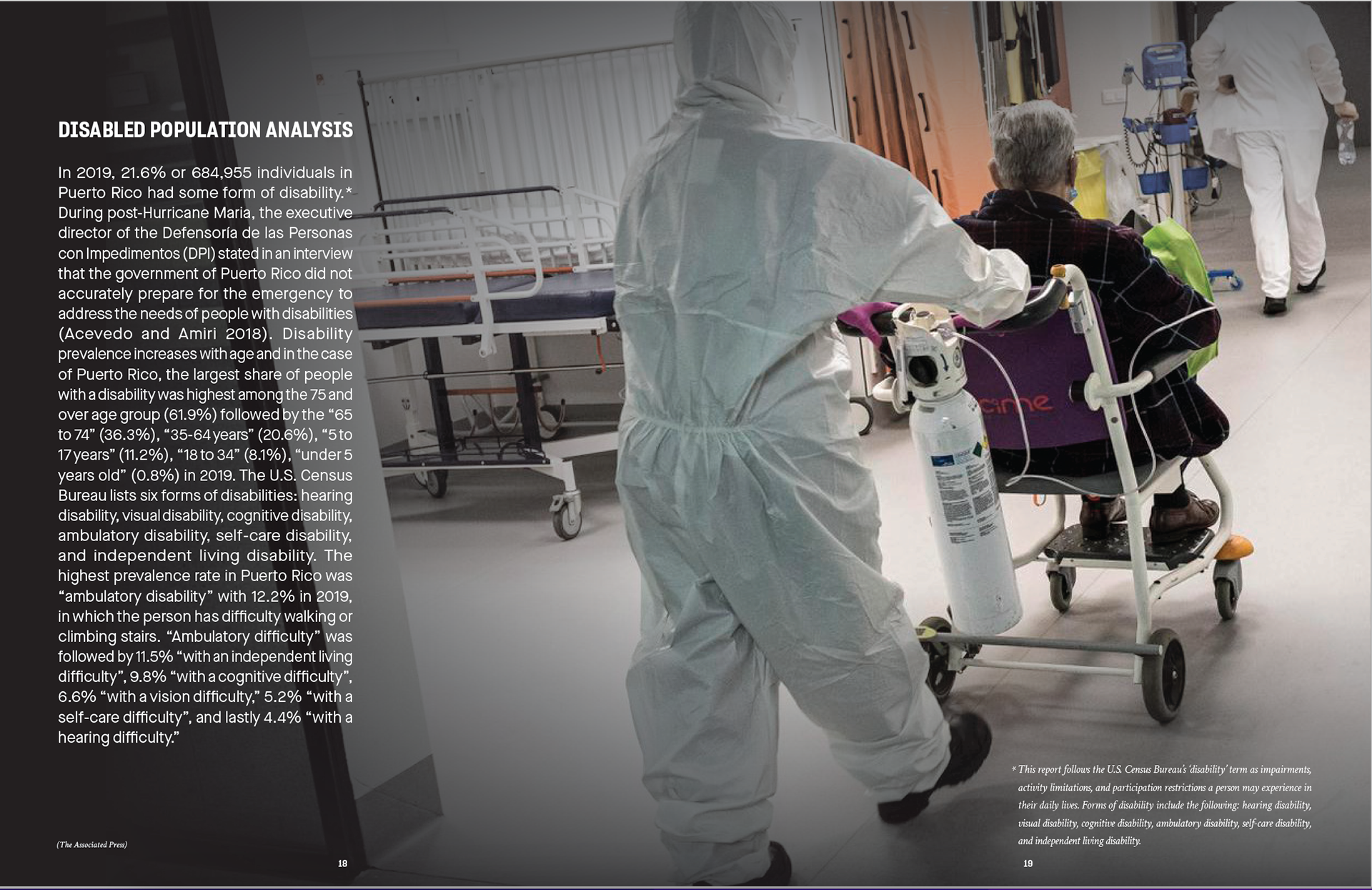
Getting images to capture the subject matter was very important to me. The first spread is showing how normalized the destruction was after 4 years, with a person caught off guard by what's in his hand while the rest of the street is filled with knocked over trees from the Hurricane. The second spread was a subtle approach to showing an aging population. For me, hands are a great symbol at showing humanity; this picture's details in the hands, as well as the cane captures the aging population without having to show anybody's face or using a specific person's grief to make a point. The last spread shows a wheel chair to capture the idea of the Disabled population.
I also was tasked to make a timeline inside of this report, so there are plenty of other images here as well.

While not a lot of changes to the formula, I think a subtle approach to change goes a long way in making something that was already good, even stronger, and breaks up the pages and pages of graphs and text.
Printed hand out/materials