Vida & Hacienda is a book about the life and work of Don Pedro Albizu Campos, a pivotal figure in the fight to gain independence for Puerto Rico.
For this project, I was already given the art, and was tasked to design the type, and adjust the colors.
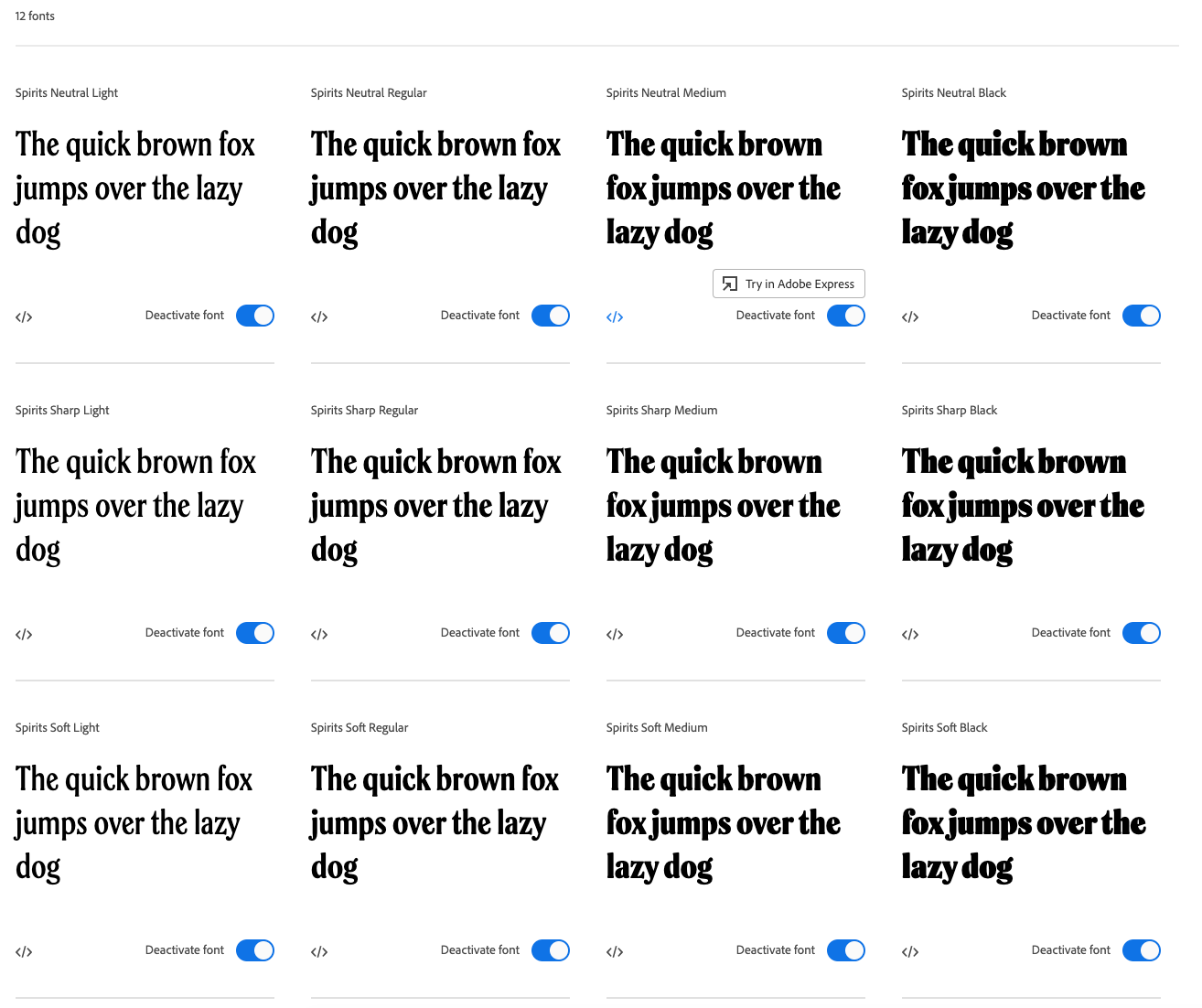
When Looking for a typeface to represent, it was important to me that I find a typeface from a latin american origin, so I searched for some fonts via Adobe font. These fonts are the fonts that I stood out to me while searching: The first font is Lobster by Pablo Impallari, The second font shown here is Mixita, by Rodrigo Fuenzalida, and the final one, which is the font that I went with in the end is Spirits by Alfonso Garcia.
I went with spirits because it felt stronger and more stable. I liked that it stood taller than Mixita, verticality represents the strength which is in line with Don Pedro's journey as a leader with many obstacles in his way.
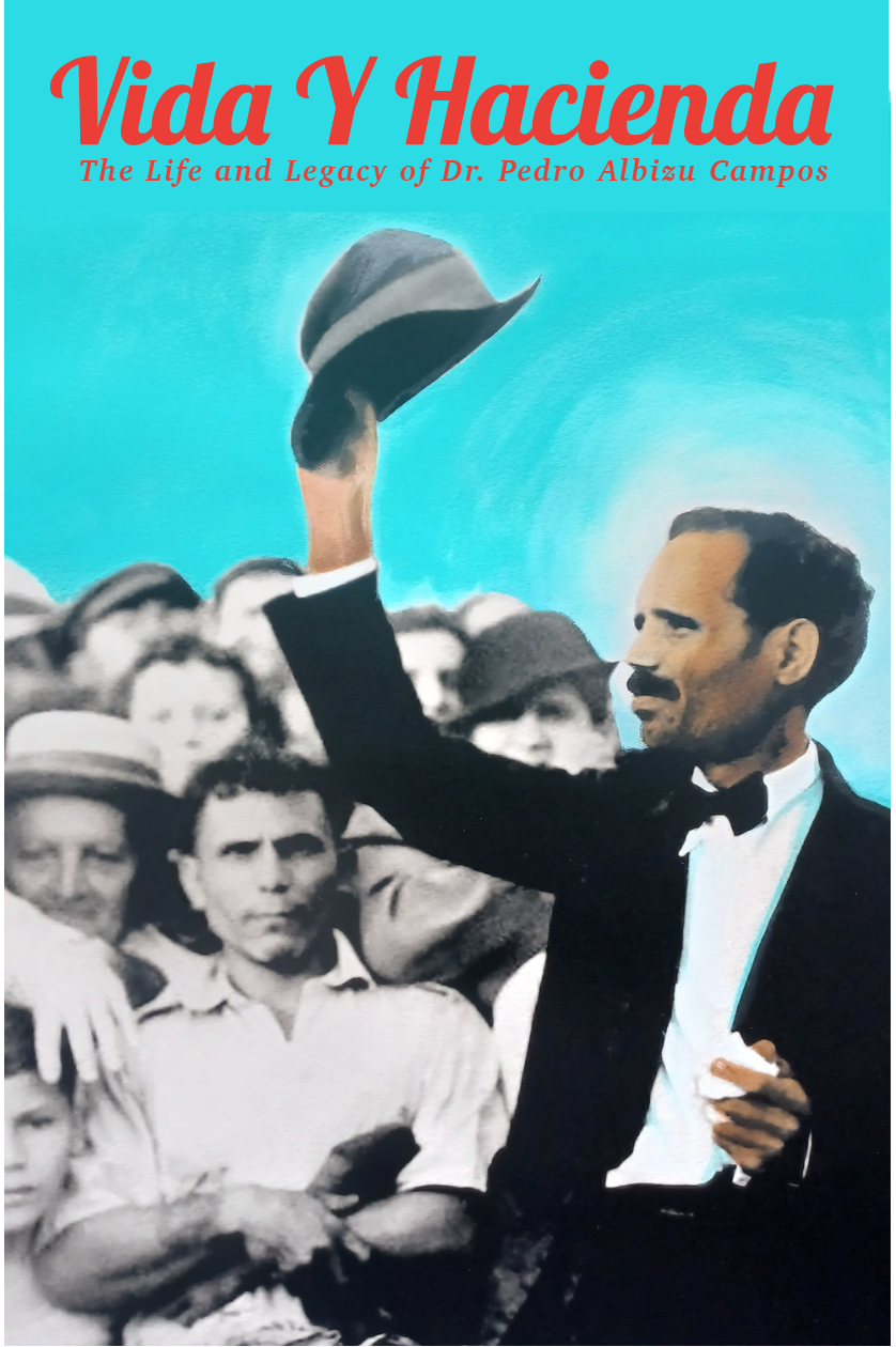
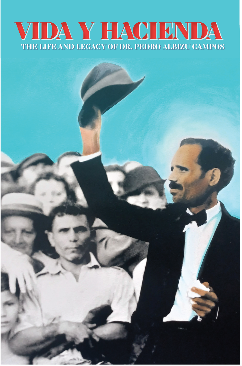
Another reason I liked Spirits is that it has plenty of styles and weights, which gave it variety while also being cohesive.
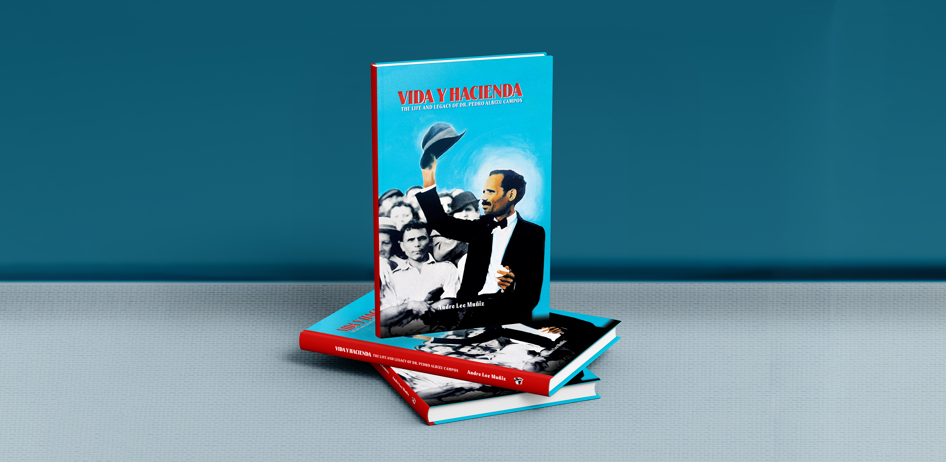
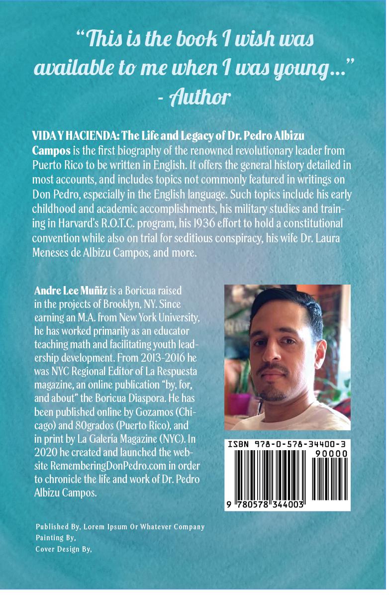
After choosing the font, I had the spine, and the back cover to design as well. Here's my first draft design next to my final for the book cover:
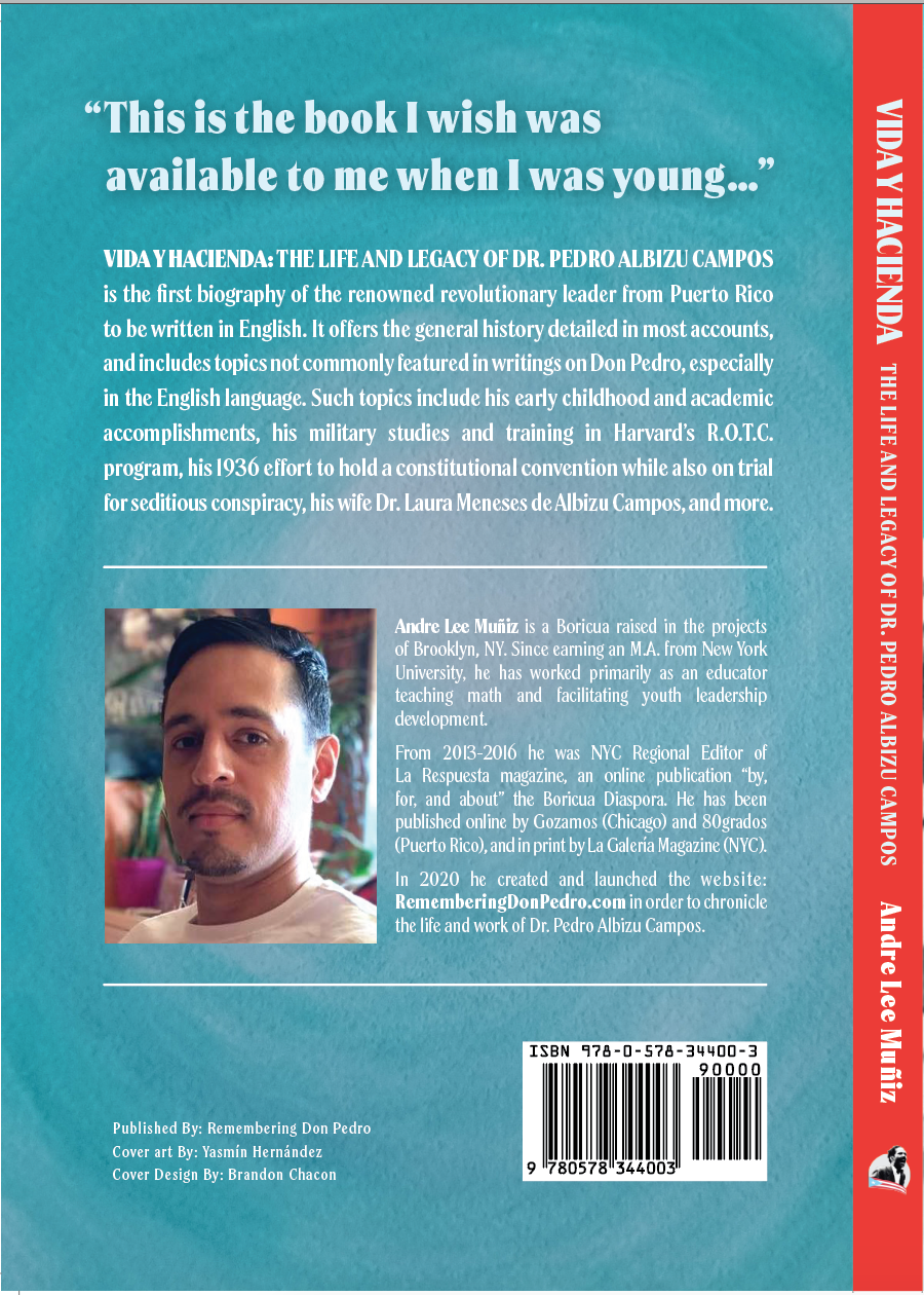
The justified text felt stronger, and in line with what I said earlier about the Spirits font. Ideally all of the items should represent the feel as well. I made the Spine red to evoke the Puerto Rican flag, as well as give a call back to the title on the front.
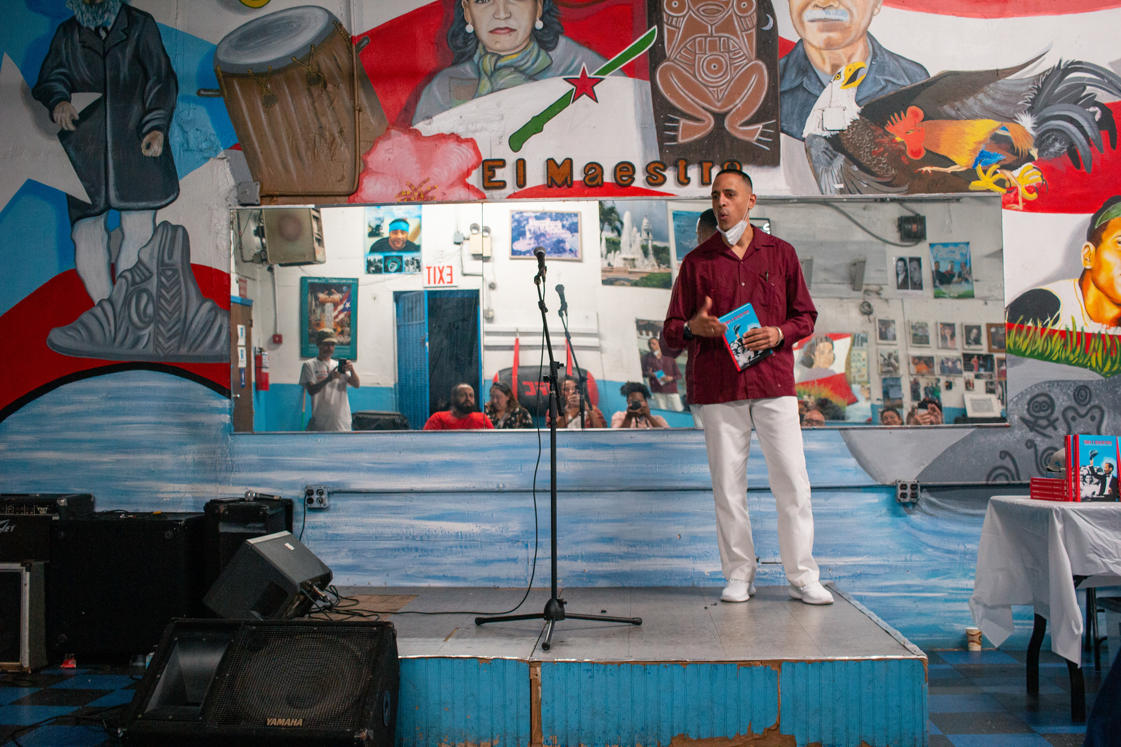
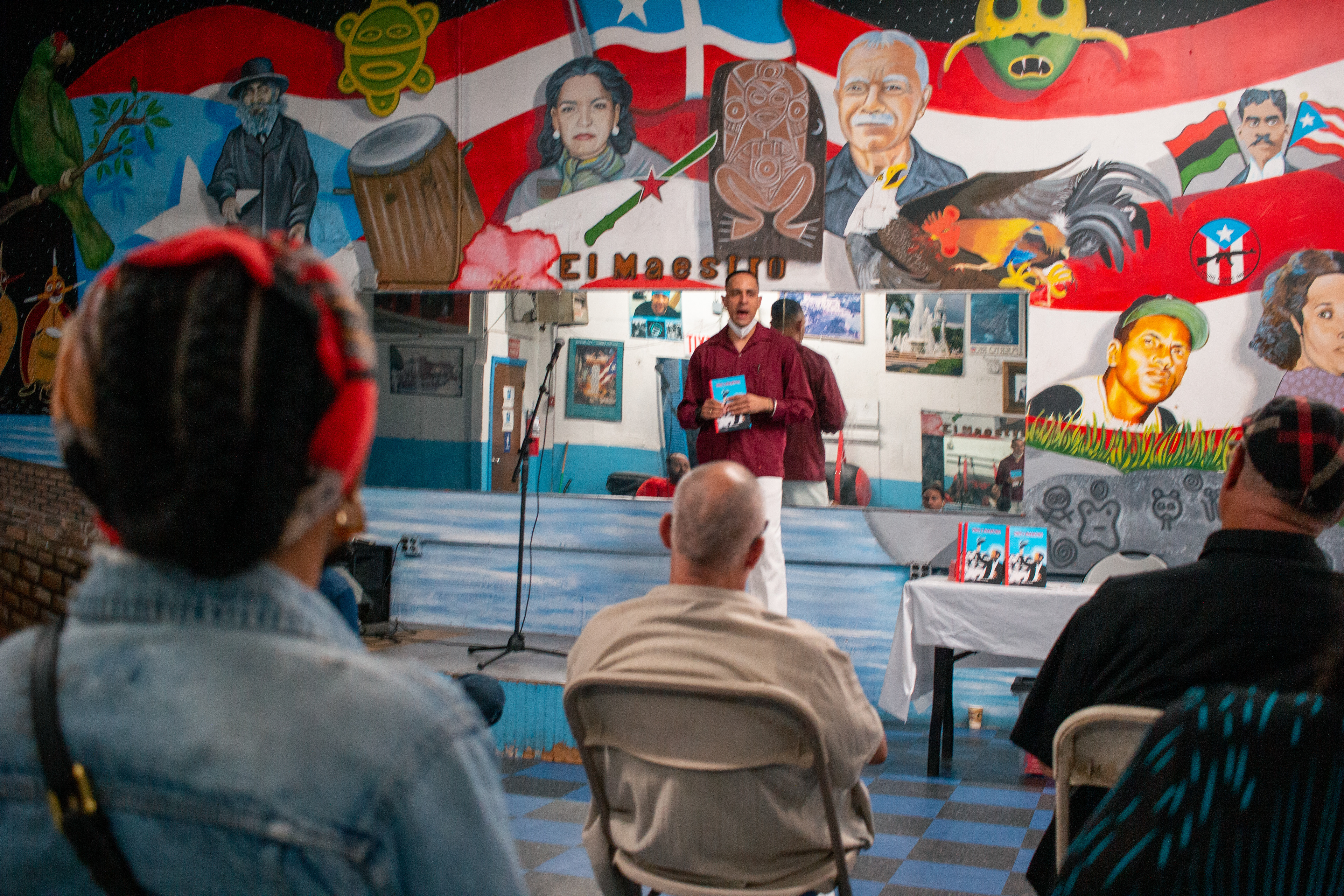
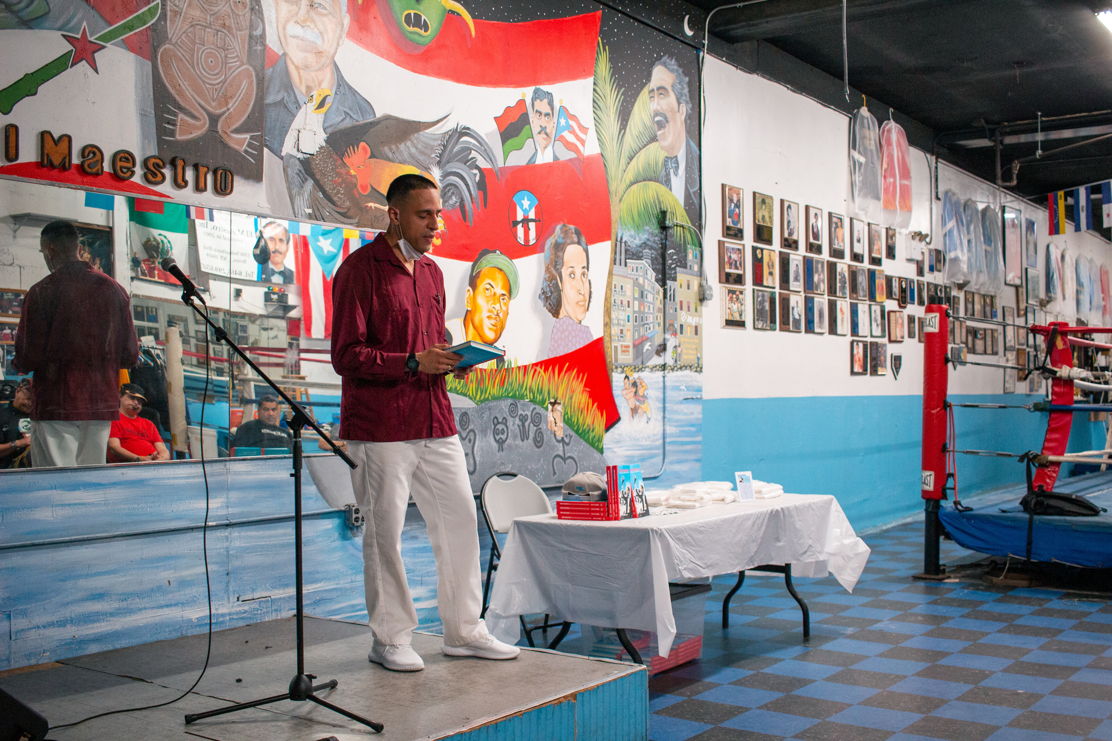
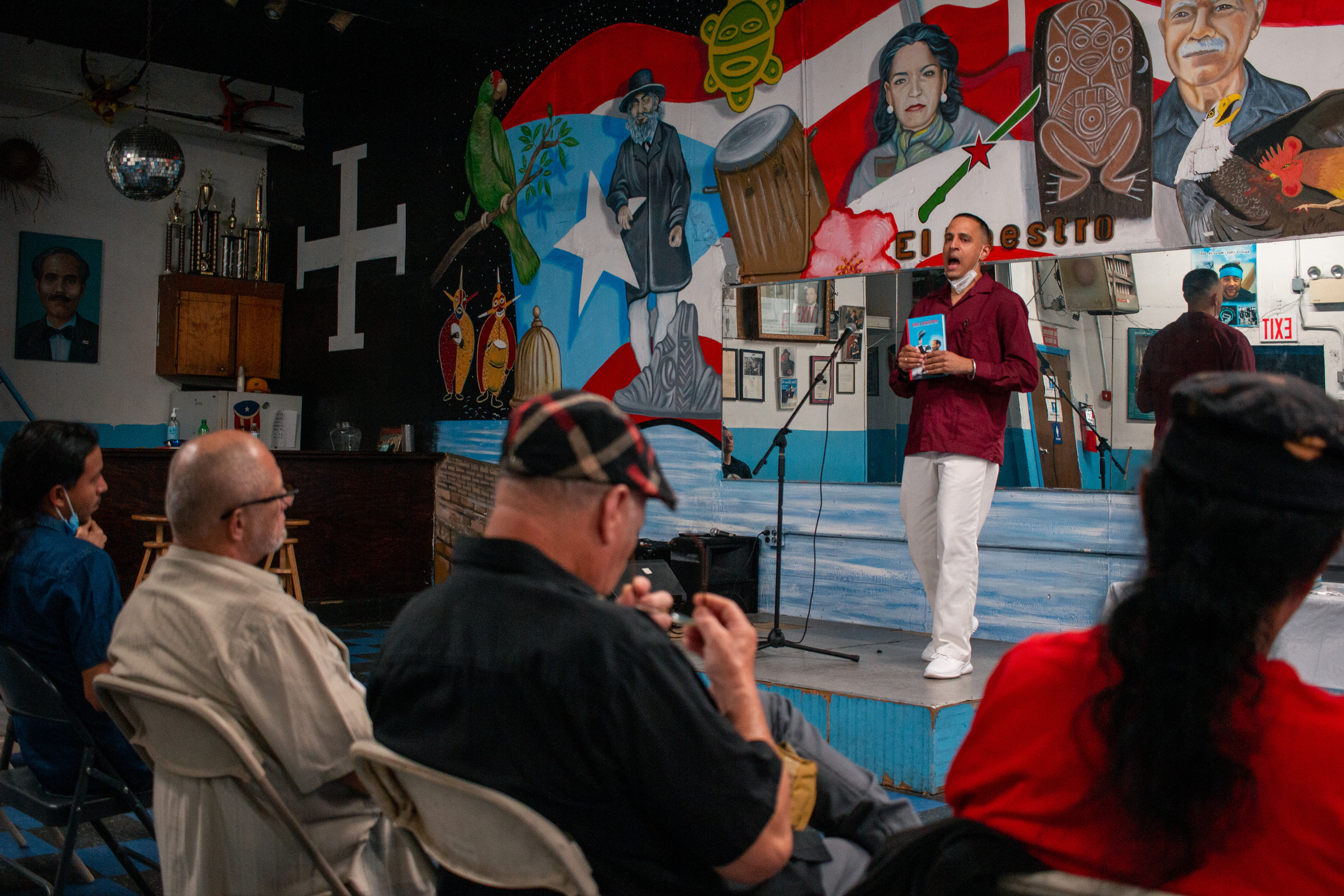
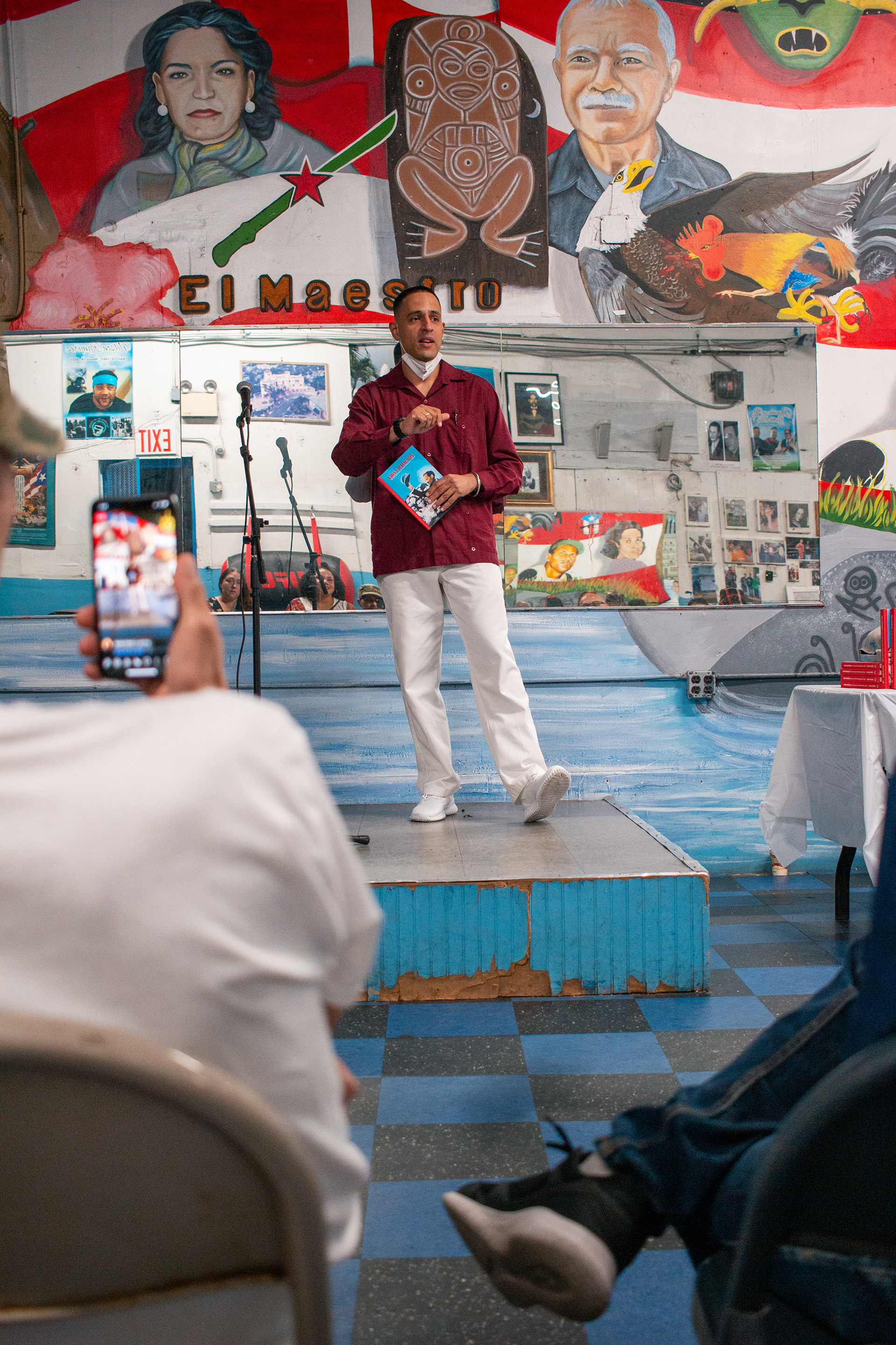
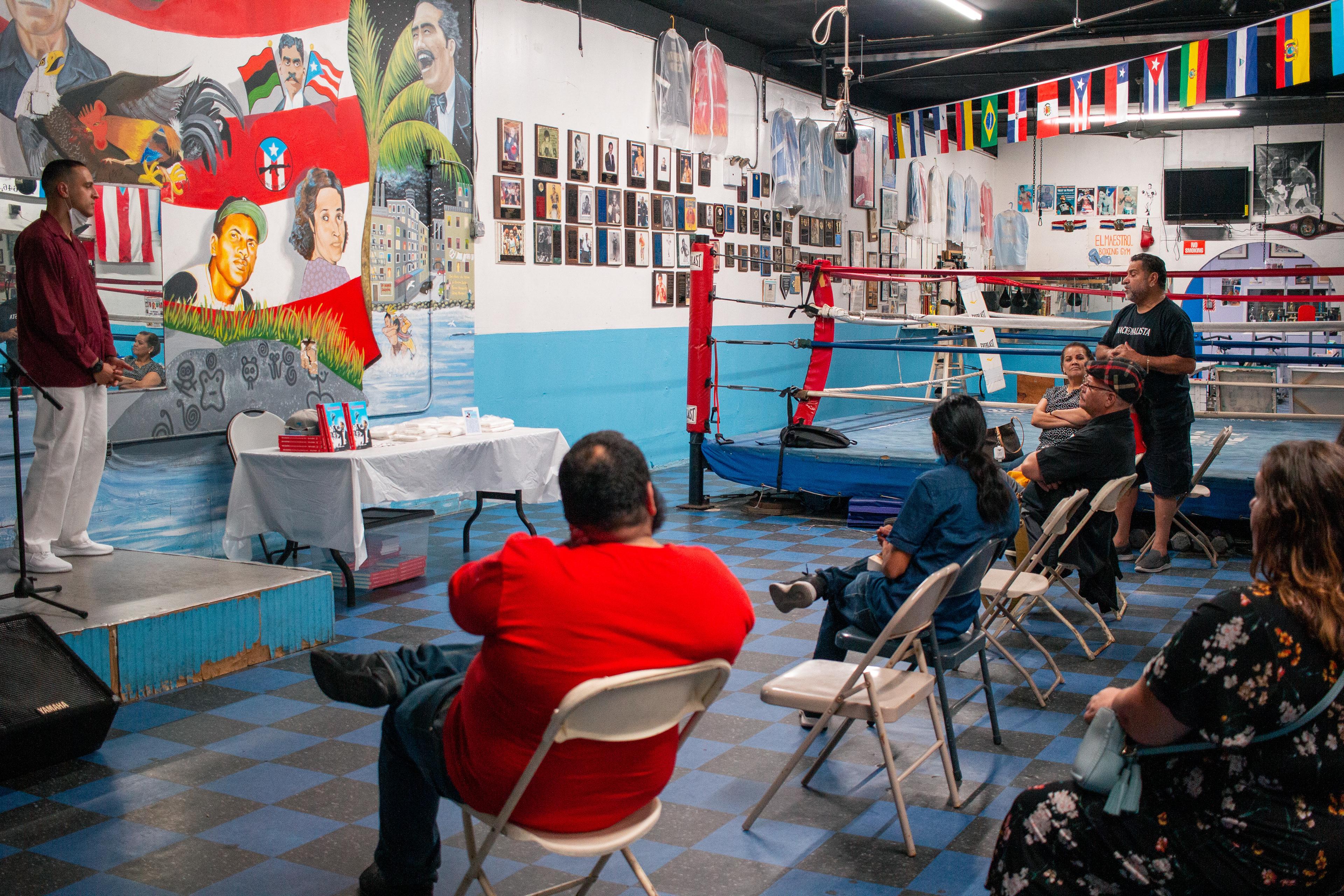
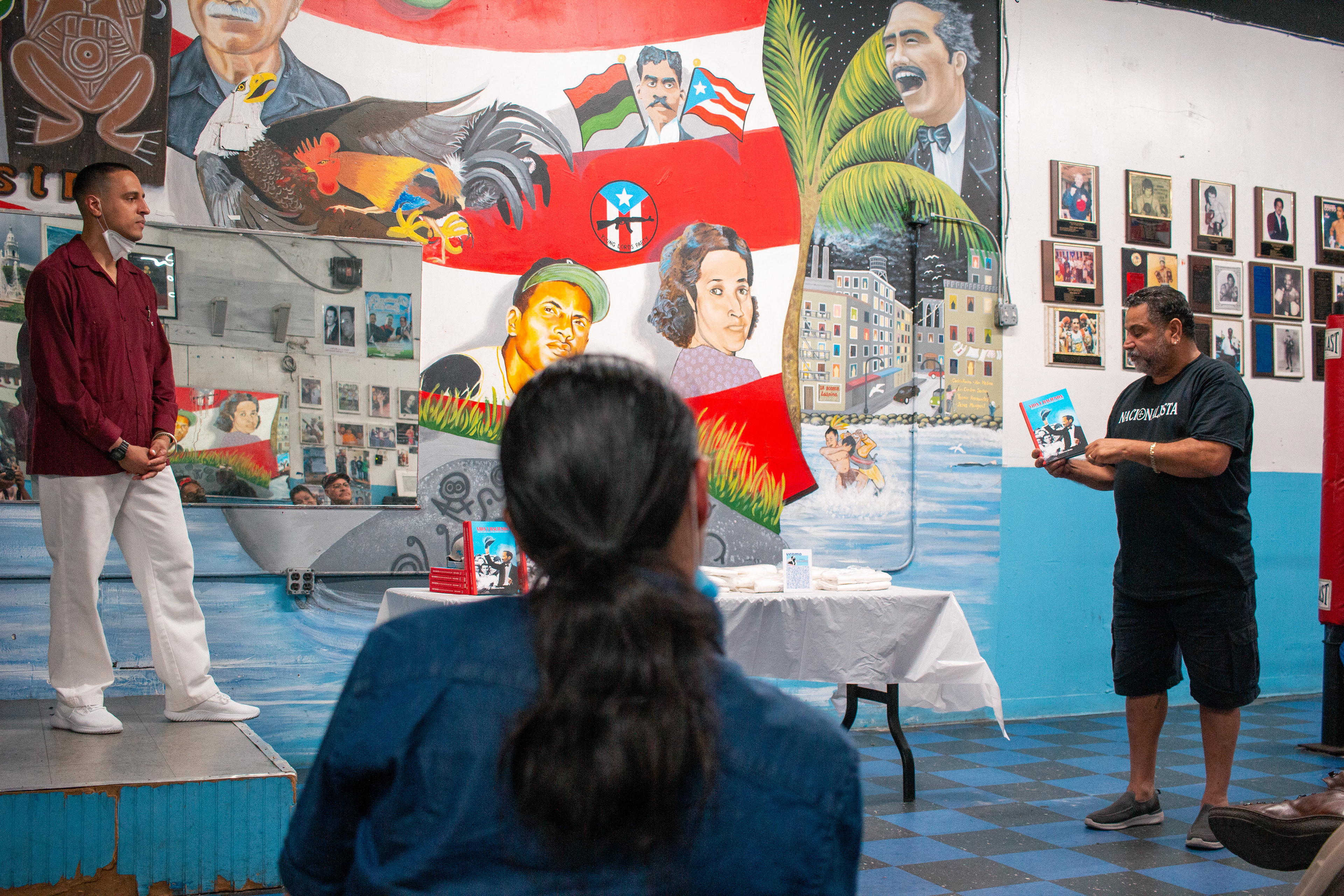
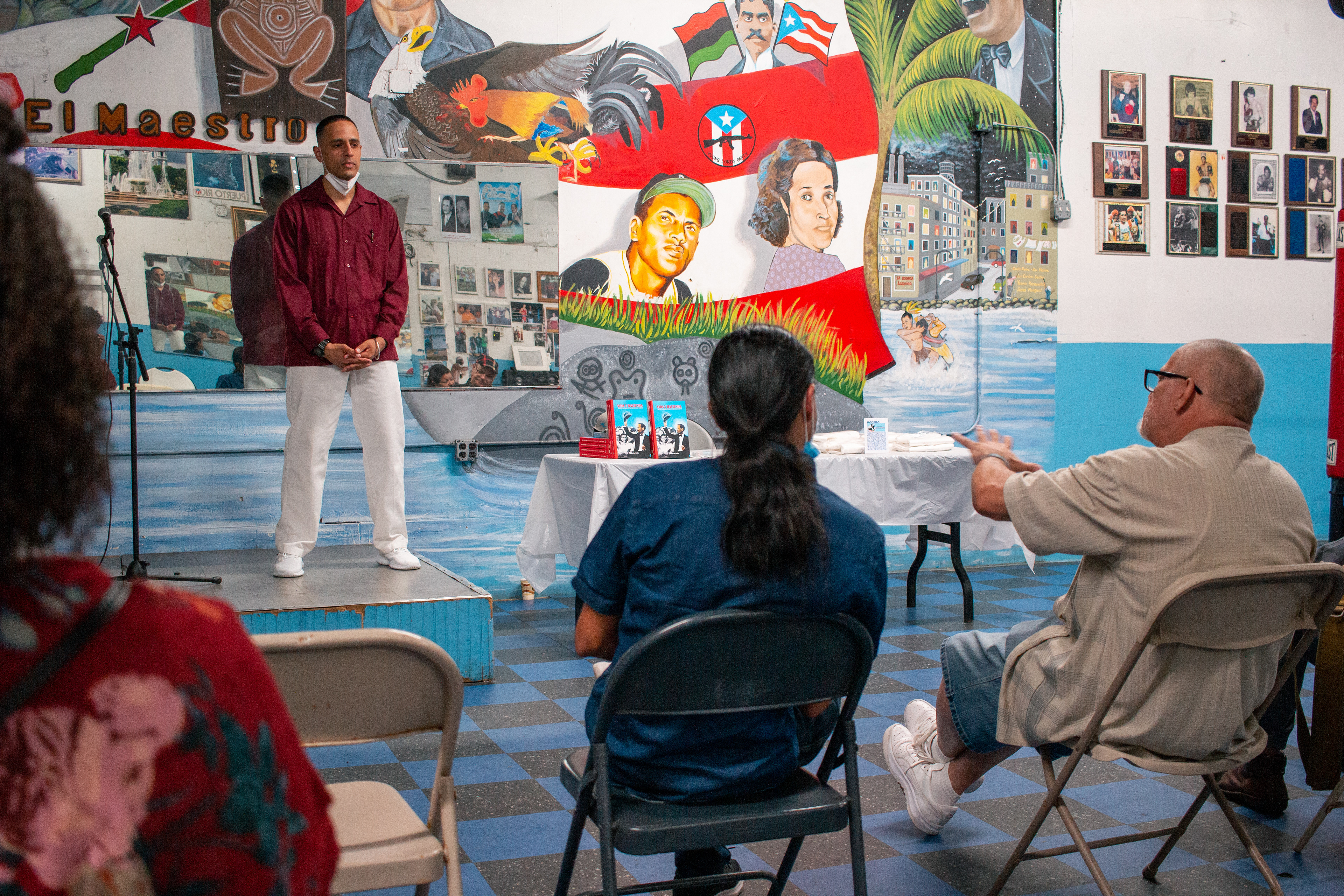
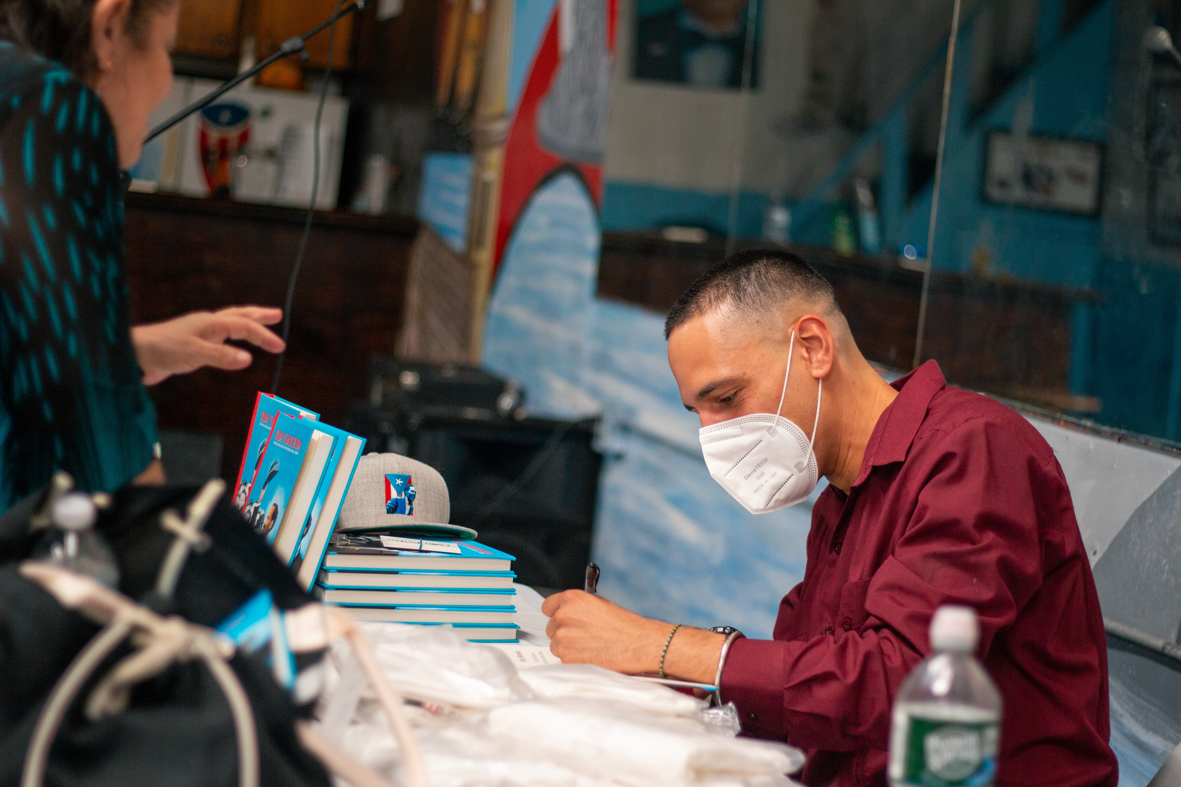
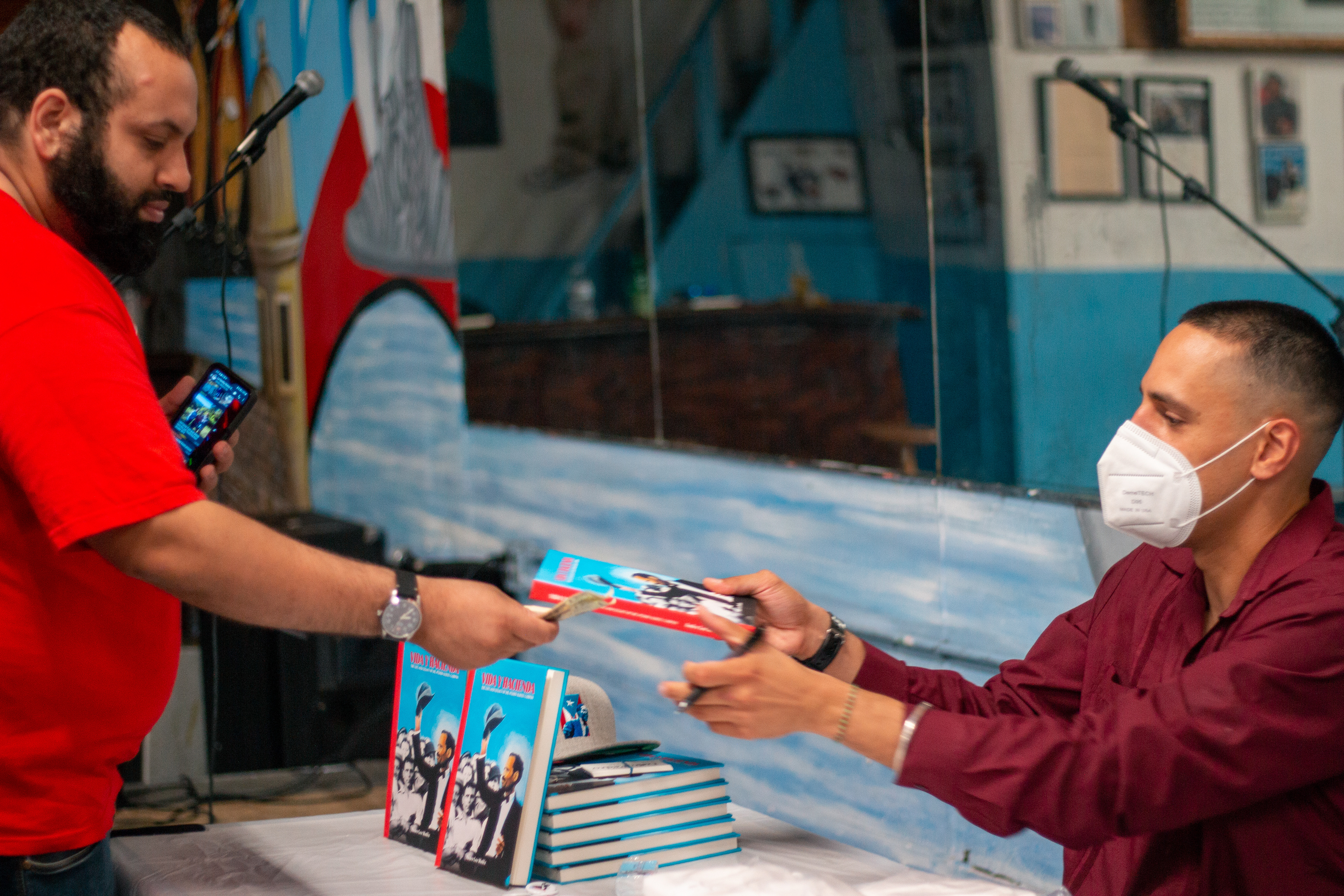
VIDA Y HACIENDA BOOK SIGNING
After finishing the book, I was also tasked to make a promo for the first book signing/author meetup. I made this mock up and made this design to be posted on instagram.


I even attended the event myself and took photos for the event: