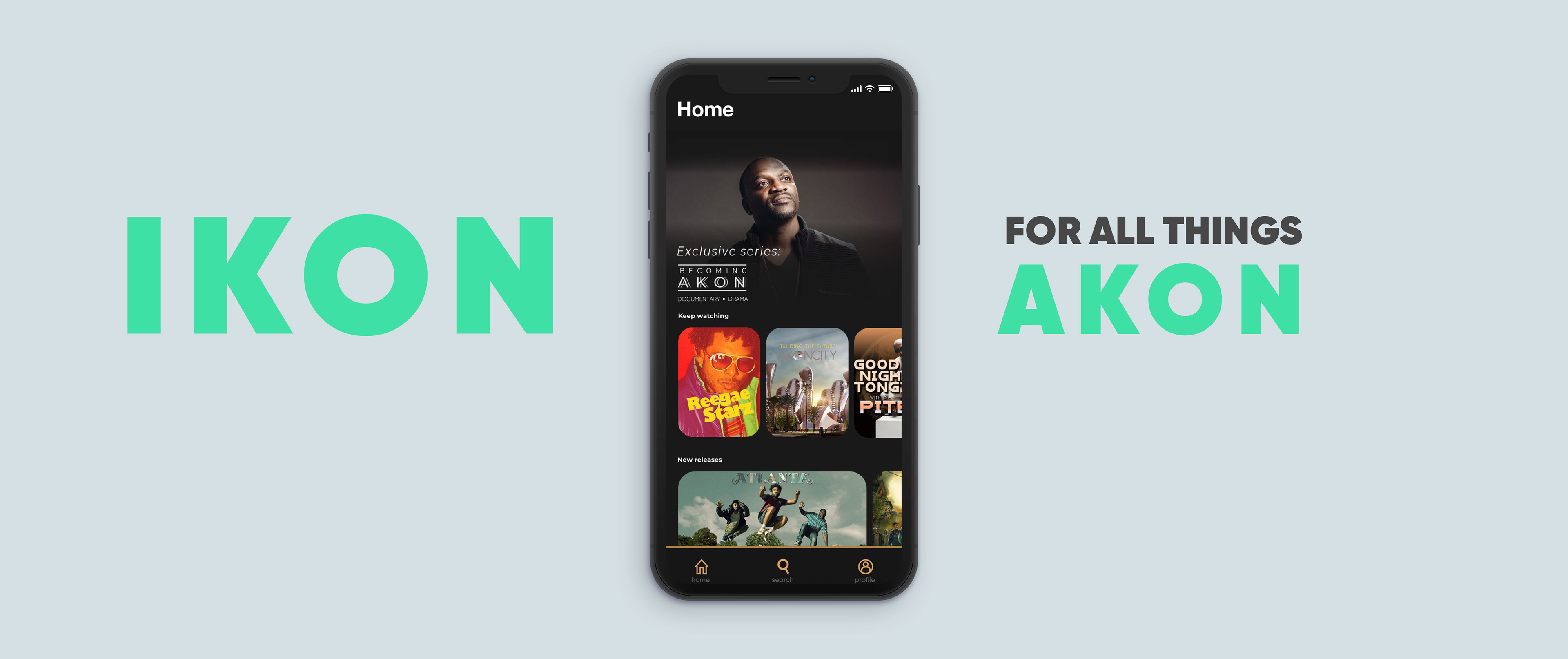
The IKON app is a prototype based on an app that I started in 2019 during my time with looklive, a startup that focused on celebrity culture. Their idea was to center a celebrity figure as the selling point to new streaming services. For example this one is centered around Akon, so it would be shows about Akon, shows about his friends, and shows that he likes/has curated to come on the service. If successful, this is something that would expand to other artists and they would have their own streaming platform as well.
While at looklive I didn't have the opportunity to finish the original app because the startup had started to fail soon after I joined, but I've decided now, 3 years later to finish the project with no motive other than just to have fun and add it to my portfolio.
The prototype will be embedded at the bottom of this page, but I would like to first show some process, starting all the way from my initial designs in 2019.
Initial pre-app designs in 2019 (with Looklive)
I was tasked, not only to create the app from scratch, but also to create other designs such as a landing page, and pay screens.
While these remained unfinished, I wanted to highlight these designs because they are the first designs that I did for this project, and they show how far the project has come since this point. I also made the same kind of content for T.I, while also making up my own ideas of shows that T.I and his team might create. For both of these designs and the apps that followed after, I had to comb through plenty of images of the respective artist to insure that these looked as legitimate as possible in order to sell the idea to the artists.
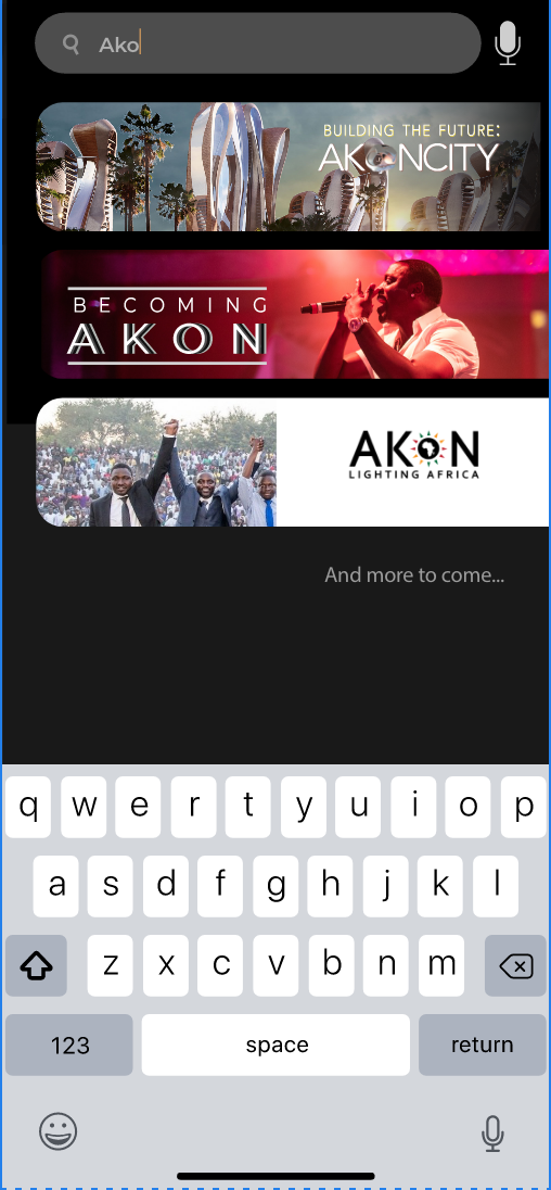
IKON APP
Before I go through my process, I would first like to show a comparison. Before The Ikon app, I started a T.I app during my short time at looklive. I won't spend too much time on the T.I app because these designs were never finished, but let's compare the first app's home screen design (On the left) with the current app's (on the right).
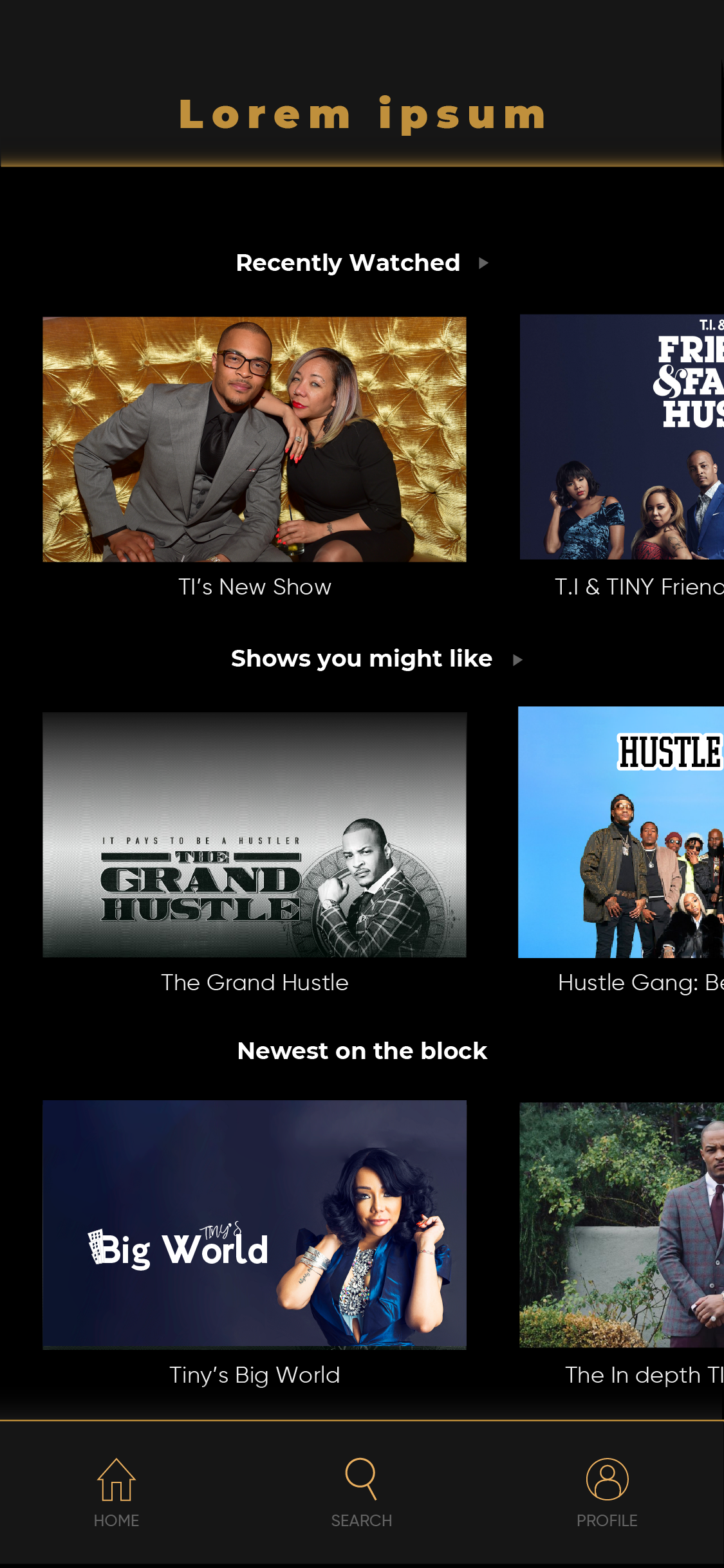
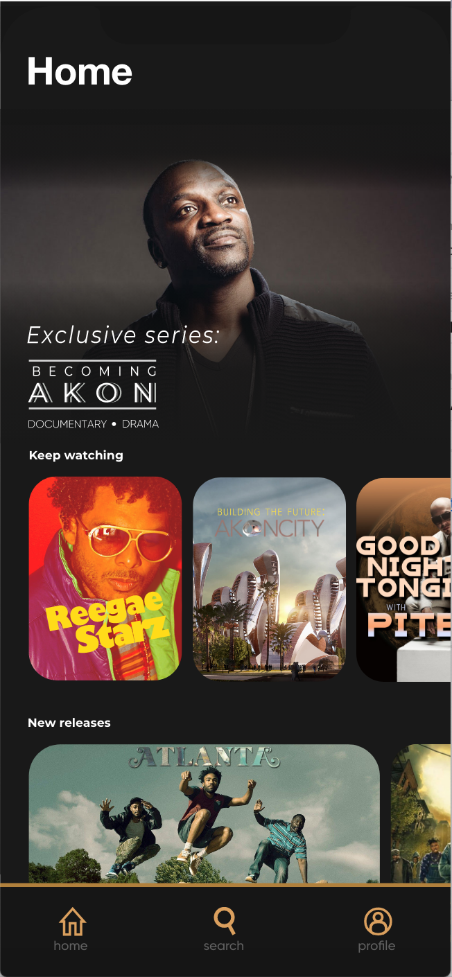
They are both a home page displaying shows for you to watch, but I've made some key changes to make the current iteration stand out. The main thing I've done here is vary the find of shapes you're seeing, so that the page isn't as boring. The TI app (Left) is the same layout all the way down, where the Ikon app uses hierarchy to give the "Becoming Akon" show a big spotlight, making viewers think about giving it a chance as soon as they open the app. I've also left aligned everything so that there are no weird spaces made between the title text and the margins like you see in the TI app.
Process
The main objective is to sell people on the idea of this app possibly being real, so a lot of the beginning process was me researching Akon, and finding out what he might want to put on his service.
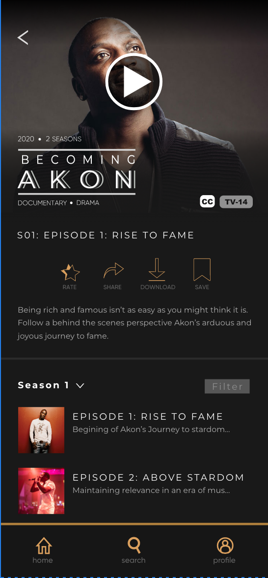
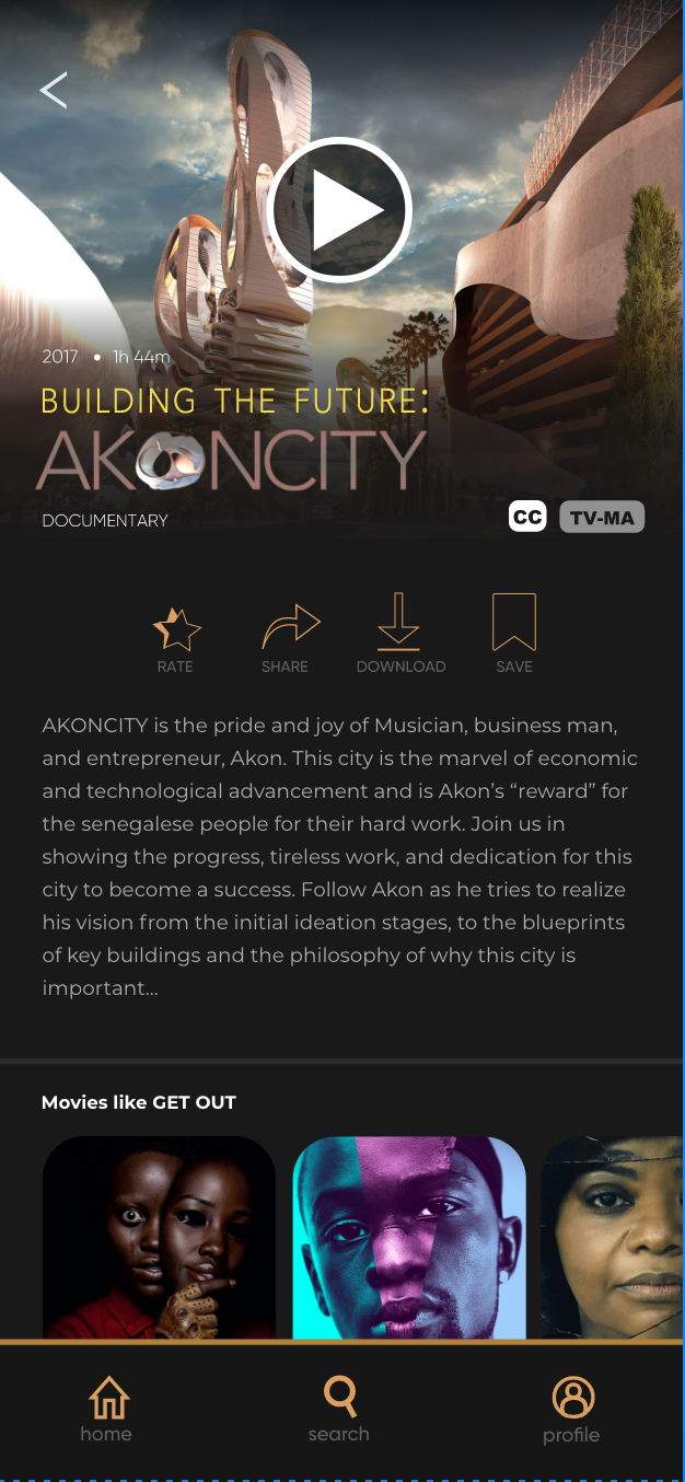
With this info, I made concepts for 3 Shows that AKON could star in: the 1st is "Becoming AKON," a show based on his come up as a musician and how it influenced his life, 2nd is "Building the future: AKONCITY" which would be a behind the scenes look on a city that Akon had been trying to build in Senegal for the past few years, (This could have both HGTV elements, as well as drama, and documentary style storytelling), and the 3rd is "Akon Lighting Africa" Which would be a behind the scenes look on Akon's journey of restoring/building power grids along african regions that are living without.
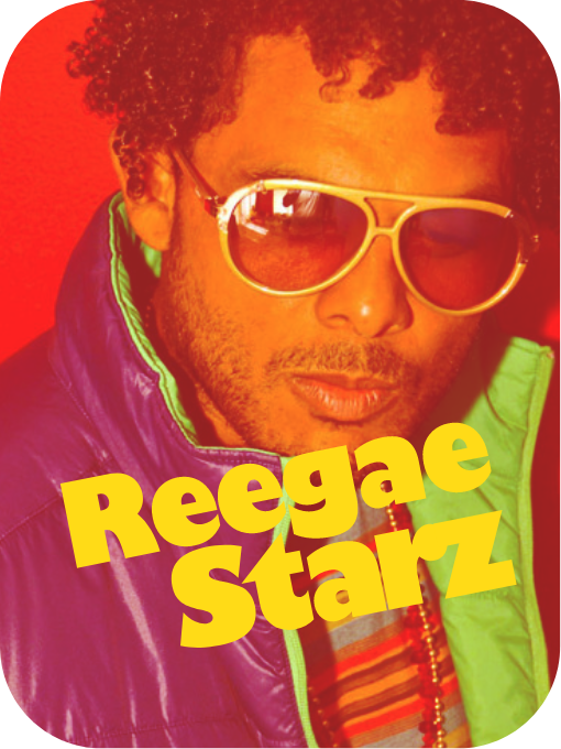
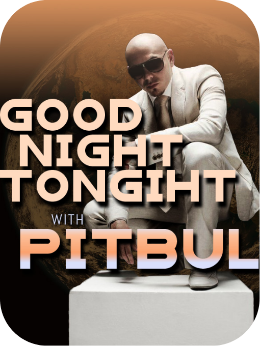
two other shows I made are of some collaborators of Akon, Don Yute and Pitbull.
Reggae Starz would be a reality show about Reggae musicians, and Goodnight Tonight with Pitbull would be a late night talk show hosted by pitbull.
Reggae Starz would be a reality show about Reggae musicians, and Goodnight Tonight with Pitbull would be a late night talk show hosted by pitbull.
Next let's talk about the overall design. I wanted to make the platform have it's own personality while also building on tried and true methods of communication with the user. That being said, the pages have everything you'd expect them to have, but I've played with the presentation.
I wanted the app to have a regal look to it, which is why I choose gold color accents, which pop well against dark colors (also I am just a fan of dark modes), hence the dark gray background. Inspirations I used include Spotify, The TED app, Crunchyroll, and Tubi, but my goal was ultimately to build something grand and regal with the knowledge that I gained by inspecting these sites.
My design choice to make the media have rounded borders is a subtle call back to the organic shapes in the AKONCITY building plans. My thinking is that Akon must love the more organic shapes, so why not make that subtly a part of the app design.
The Final design is embedded/linked below if you would like to see it.