This project was a design test where I was tasked to make a case card and
an invitation. Here is a preview the final designs:
an invitation. Here is a preview the final designs:

Case Card Process:
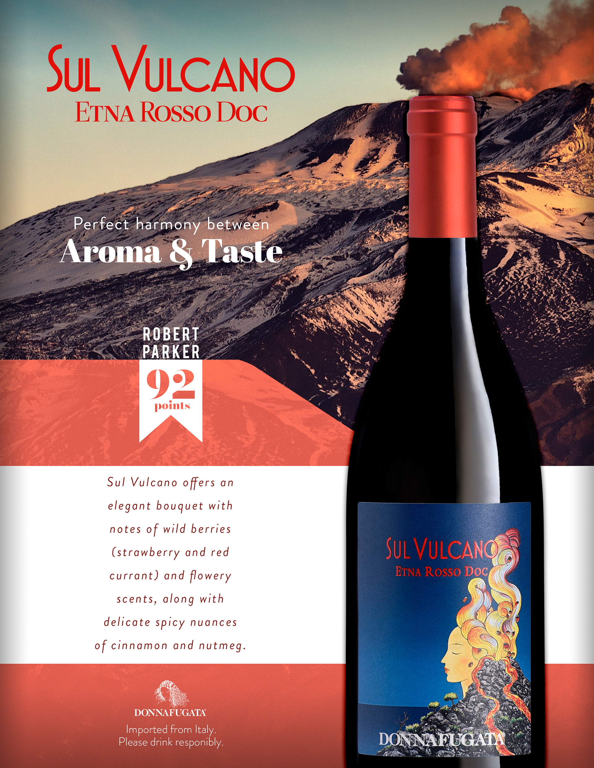
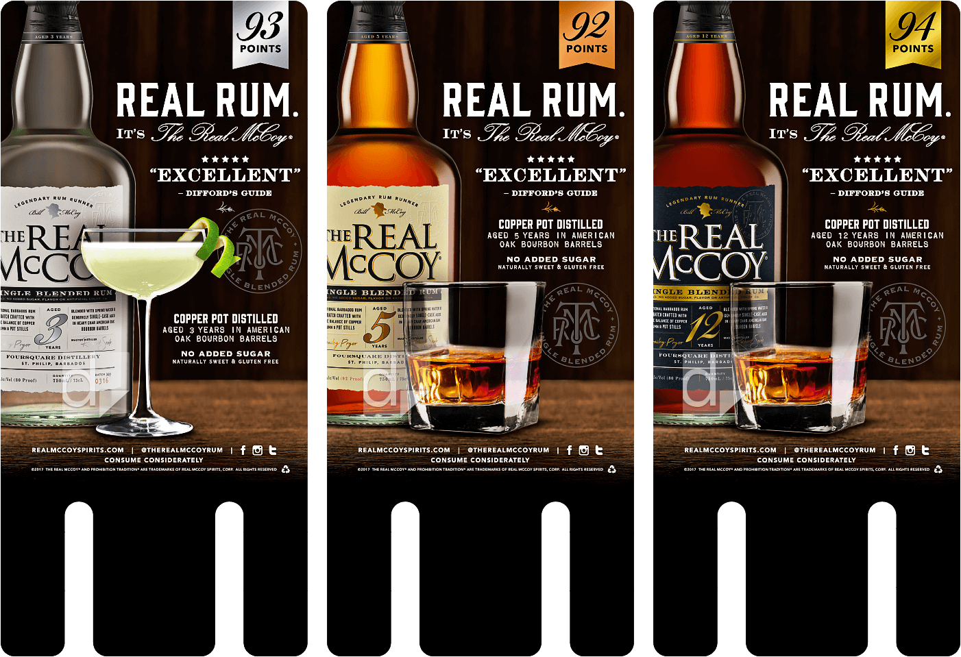
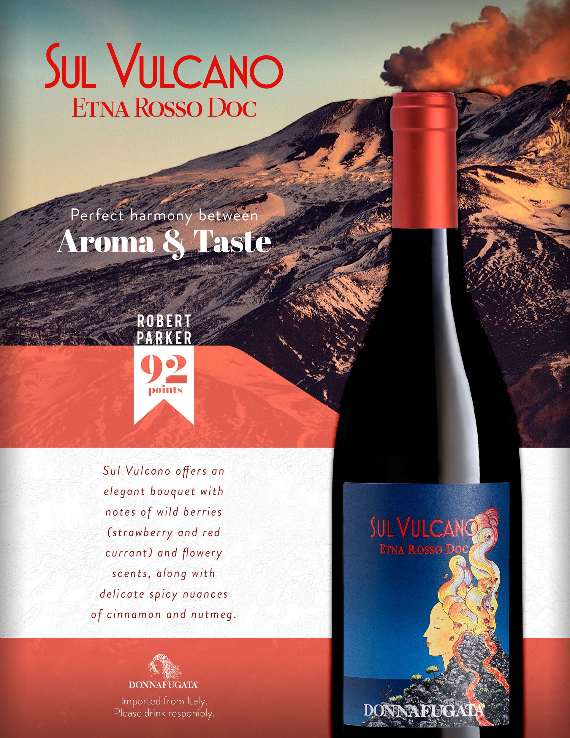
Before putting pencil to paper, I researched what a wine case card could look like. They seem to have similar layouts and themes. The image of the wine is the star of the show and is important to show to the viewer, as well as other key points of information such as the Robert Parker score. I took this into account for my design.
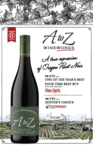
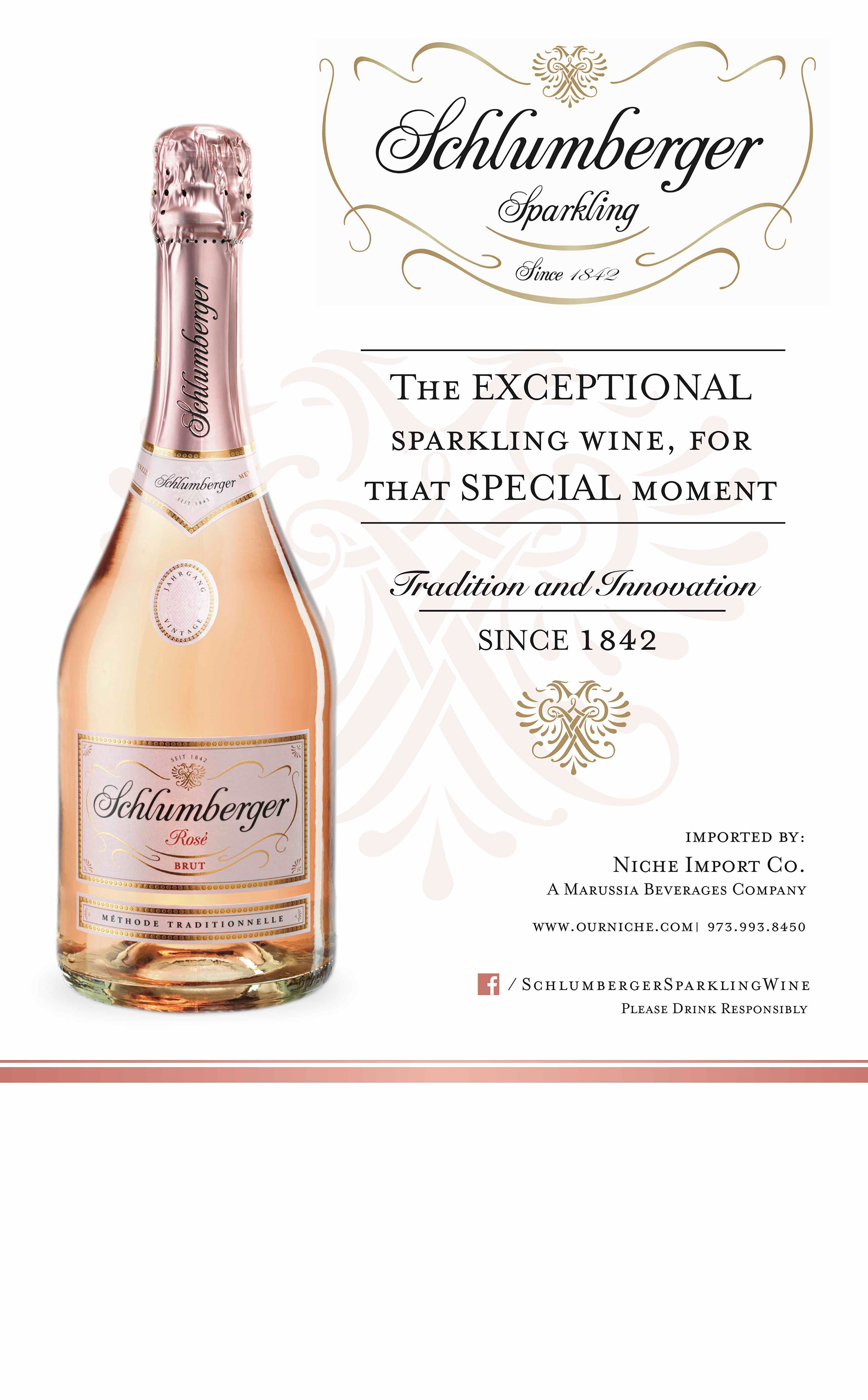
The next note I took from these designs is where they differ; they use the rest of the design to sell you on the drink by using the environment to their advantage. The Real McCoy drinks do this by putting you in the point of view of a bar, and already having the drink poured out, The A to Z Wineworks and the Castelgiocondo's selling point is reminding us of where/how the wine is made to impress us on its rarity or freshness, the frescobaldi gives us the image of the sea and seagulls to imprint the idea of sitting at an oceanside while drinking wine, and the Schlumberger leans directly on the prestige with the cursive and the crests.
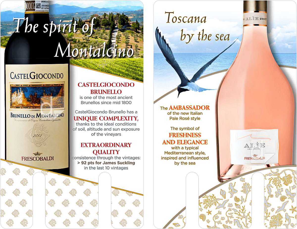
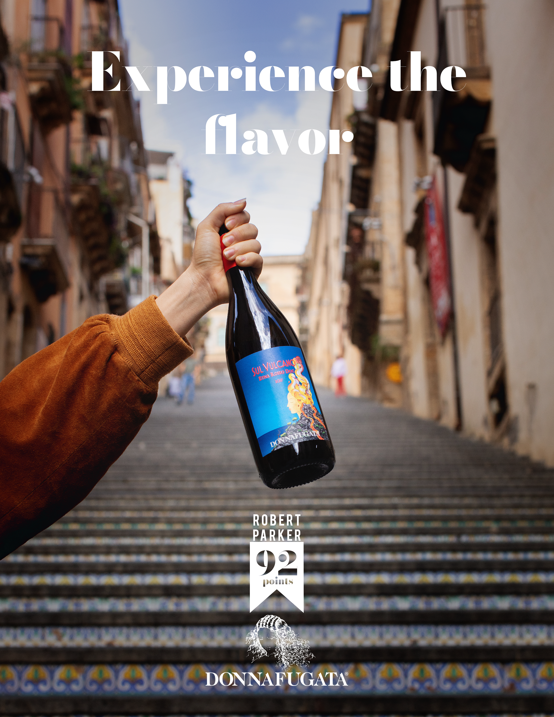
With this information in mind, I checked which approach would be best for the wine they sent based on the given information and the wine itself. After research, it seems that Sul Vulcano, the wine I was tasked to present, is notable for being made with grapes grown on soil made from dried lava from a volcano. (here's a video explaining it: Sul Vulcano - Animated Wine Story) This is very important to the identity of the wine and the history of why it tastes the way it does, so it felt like a good idea to lean into the history of the wine in the design as well.
Short Detour
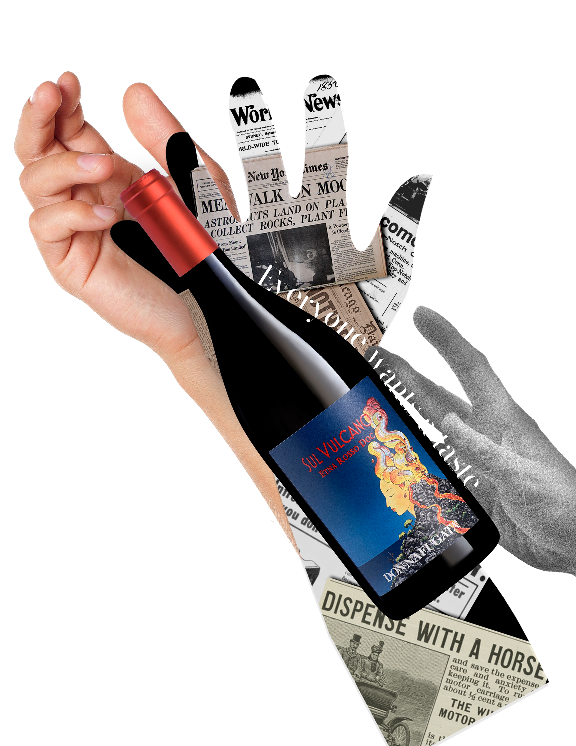
I like to try designs that go against the blueprint to see how far I can take the design. While I never finished these, I tried to see what this could look like in as a simple or "Mild" design, and then as a weird or "Spicy" design, as a way to exercise my creativity. While these seem unrelated, they do help me pinpoint where I want my design to go, and I appreciate this messy part of the process.
Inital designs
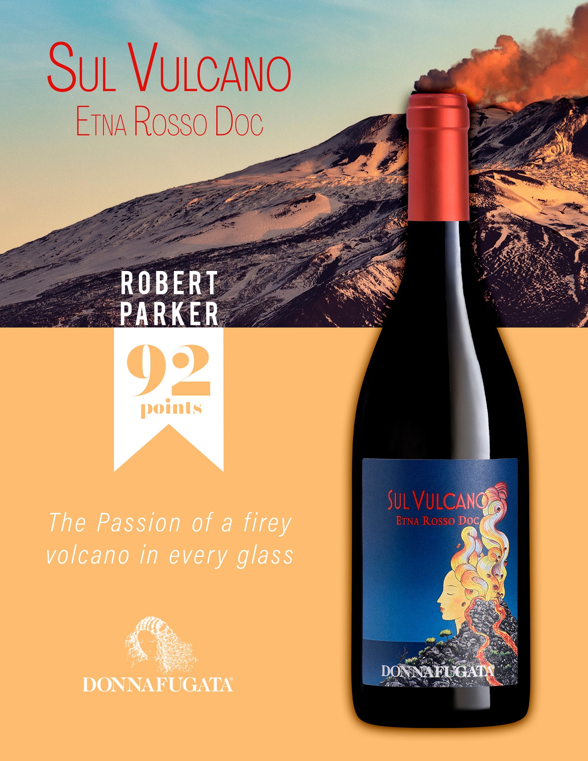
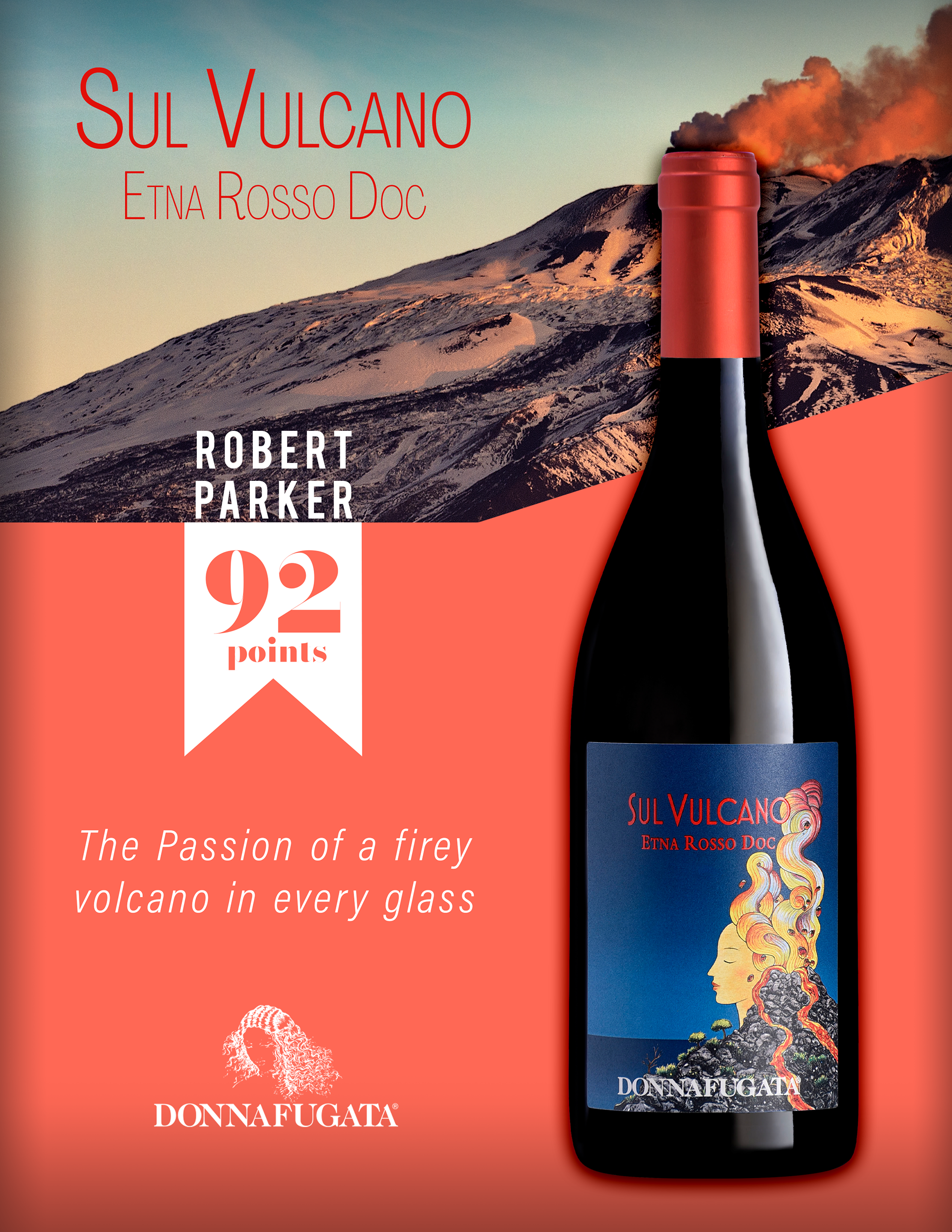
As we can see in these process images, I made sure I got the important bits of information first, which were the Wine itself and the score. From the beginning, I wanted to find a creative way to incorporate the Volcano, and I love the design I settled on where the volcano smoke is coming out the bottle. This might look simple, but for me it sells the idea of the taste of the volcano being infused into the drink, and the bottle itself being the volcano.
Next was the Score, which gets smaller with every iteration for the simple fact that the color sells its importance. It doesn't need to be massive because the white already contrasts the red enough to be one of the first things we focus on after the image of the wine.
I initially made my own tagline, and while I did like it, it didn't evoke the fancy wine taste that I wanted it to, so I used some descriptive text that was sent with the design test (similar text can be found on the website here).
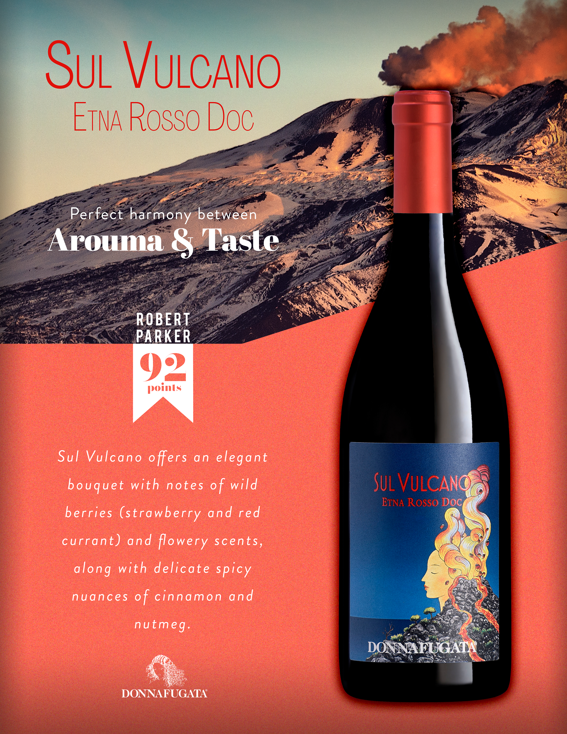
I then went on the hunt for text that closely resembles the font on the bottle to add some consistency to the "Sul Vulcano" that I have on the top left.
Final Case Card

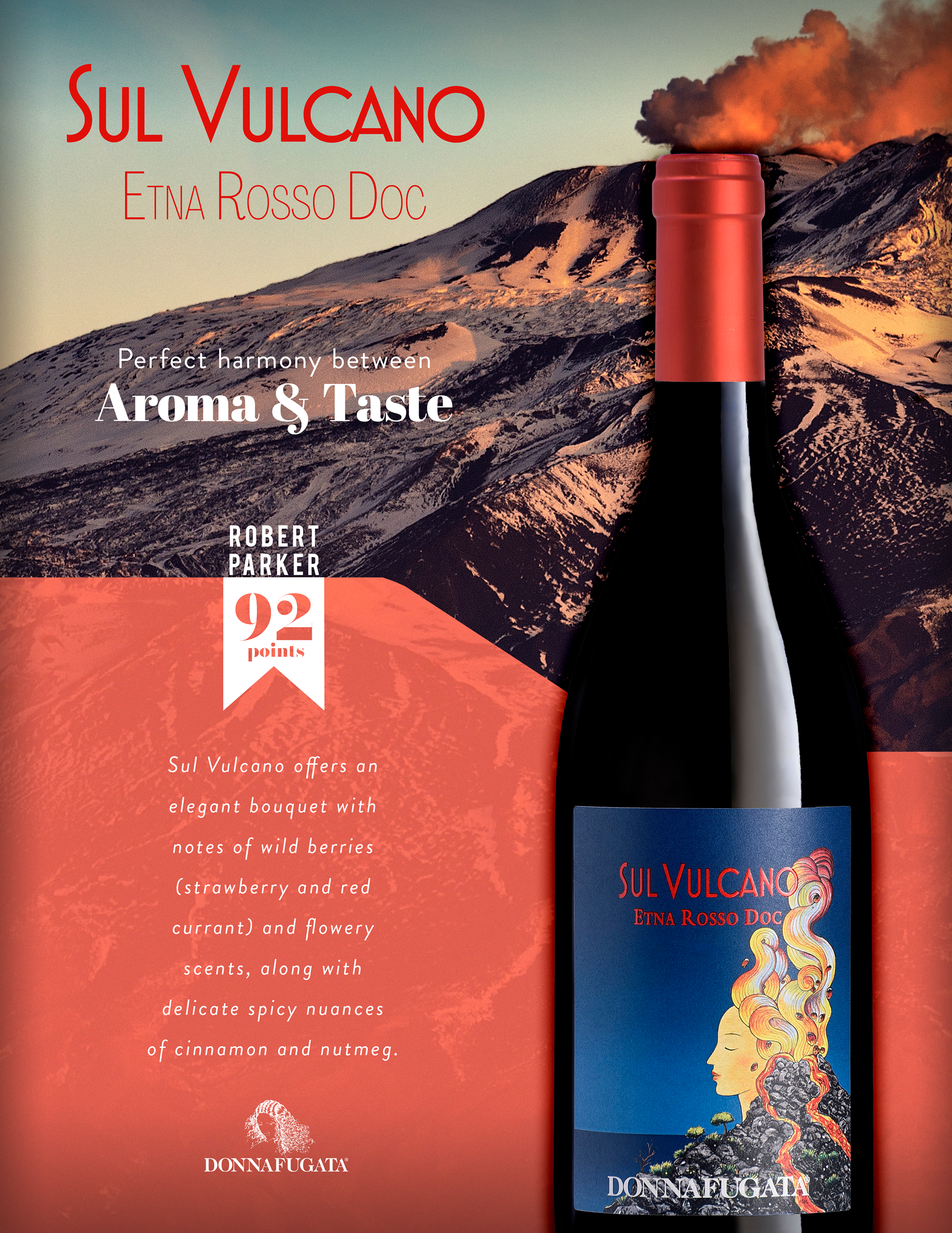
Here's the final I sent to the client. I am happy with this design, but upon doing this case study, I decided to try to add something to the design. In this next design, I've added some texture to the white background behind the text by using a high pass filter on a photo of the fields where the grapes are grown, and I've adjusted the text too. While this image already has plenty of texture, I feel like this adds more emphasis to the score, while simultaneously making the white background for the text feel less empty.
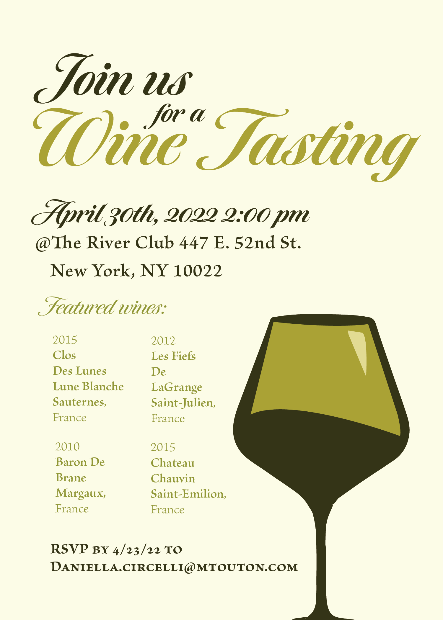
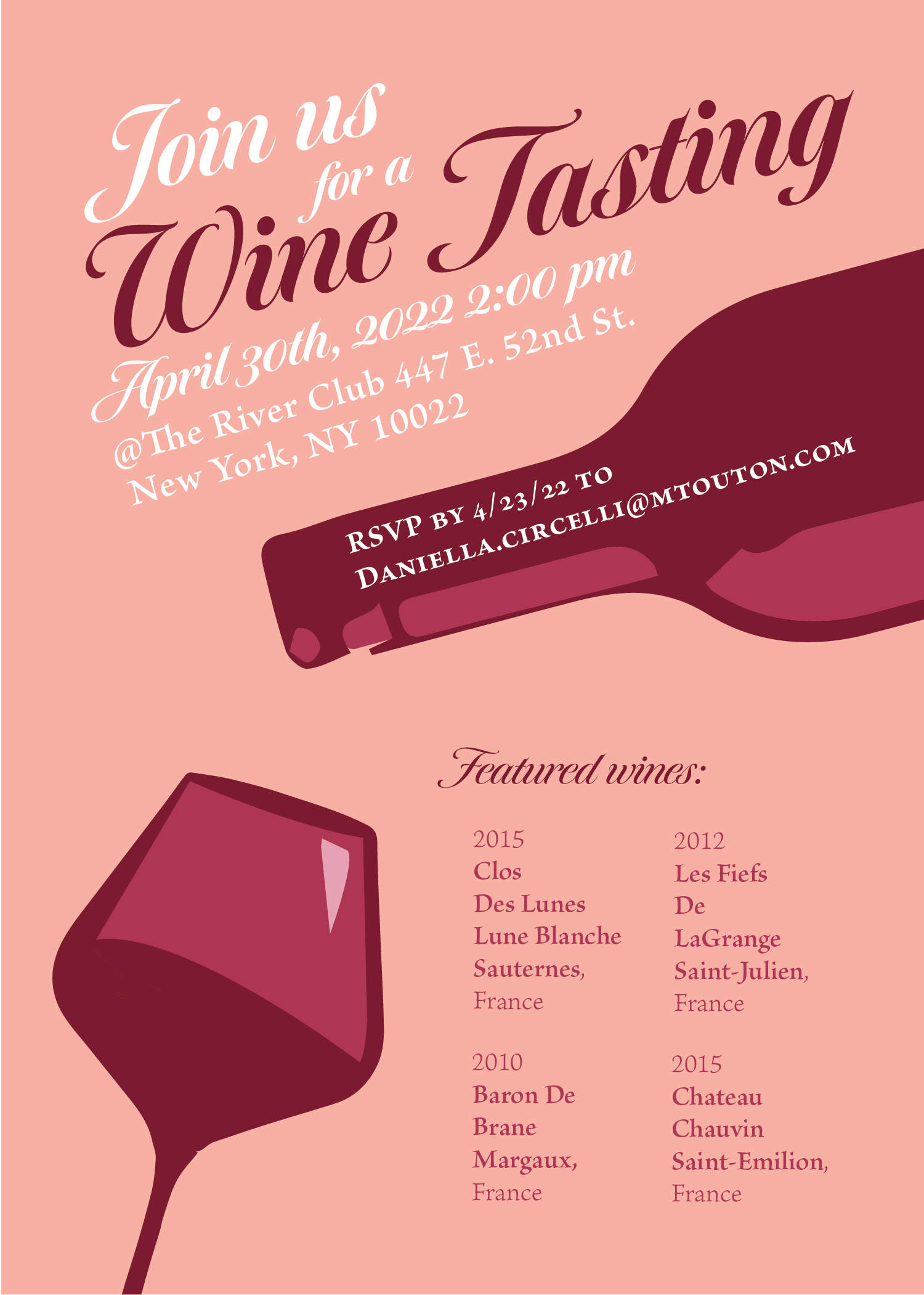
Wine Tasting Invitation Process
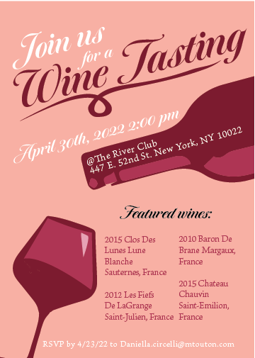
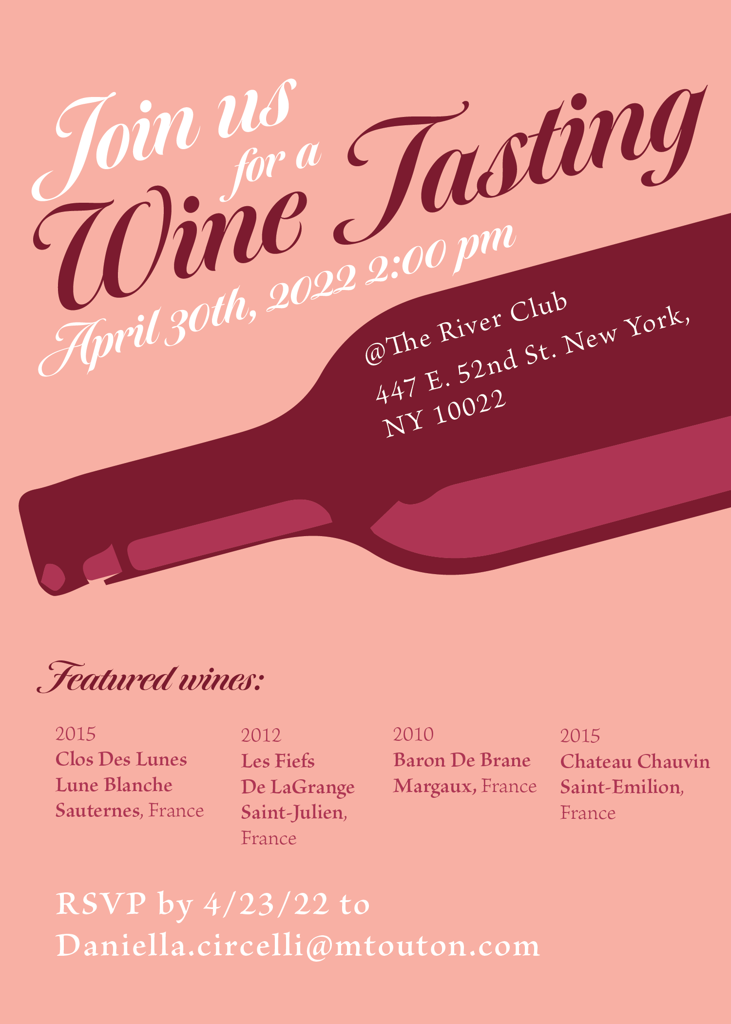
This was a much simpler design, so there was less detours and process with this one, but these are some iterations I had before heading forward with the final. I wanted this design to stand out to someone upon first viewing, so I made the text go on a diagonal, and added big images. Those elements stayed throughout the design, the rest was how to present them while still keeping key info legible and easy to find.

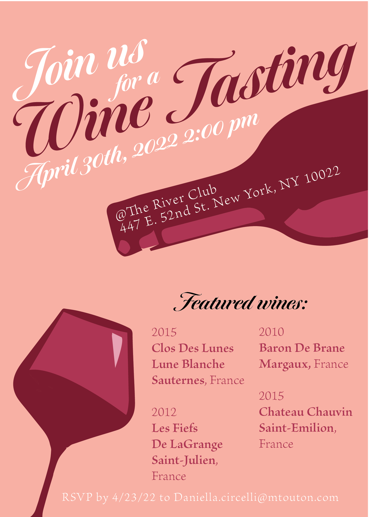
This was the first design that I made. I liked how it came out, but I then decided to make a version that is upright, to give the client a choice of style. I kept the important things mostly the same while making the atmosphere more grounded. That grounded version can be found below.